MIND MAP.
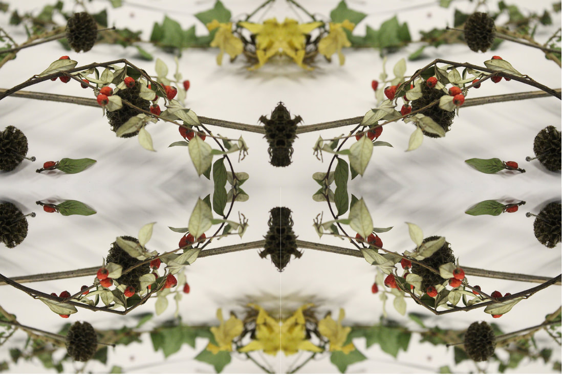
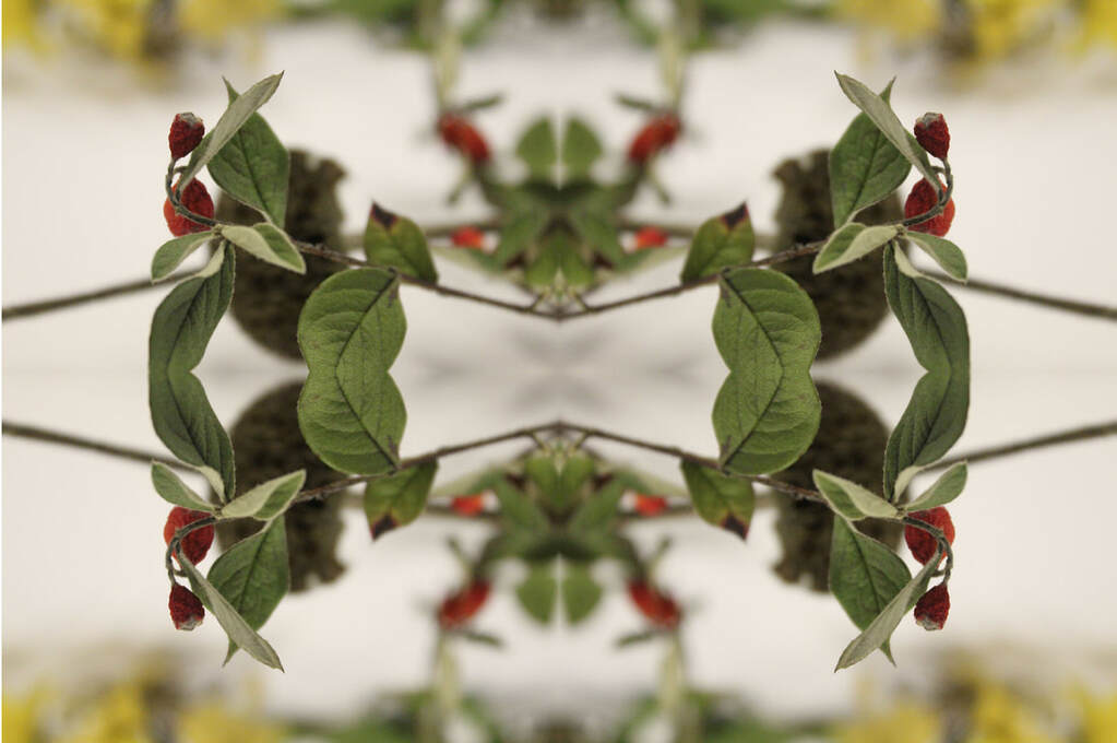
MIRRORED REFLECTION.
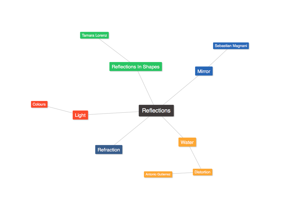
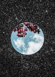
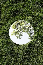
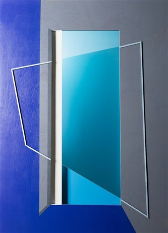
LINK ARTIST - SEBASTIAN MAGNANI
Sebastian was born in 1985 in a small village in Switzerland. He discovered photography while he was training as a media designer in 2006. After 5 years as a creative in an advertising agency, he decided 2011 to turn his passion into a profession.
|
|
|
His work involves him using a small, clean rounded mirror and placing it on the ground in the middle of a shot. This gives the effect of a piece of another photo being incorporated into another. However the overall colours and mood of the photos are kept constant. For example, the middle photo keeps the same brightness and levels of light and the theme of the colour green in both shots. However, in the third photo the theme of darkness is kept, with the common colours of grey and black (the dark and scratched wood, and the dark sky with grey clouds
First Response
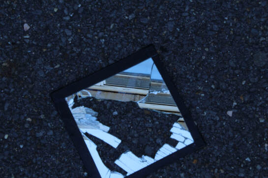
With the aim of replicating Magnani's work, I set out in school to photograph a mirror in different angles and positions.
|
|
Second Response
In the second response I set out to do the same but hopefully improve upon the first response too.
WWW: We managed to capture some good, clear images of reflection, and the cracked mirror gave an interesting distorted reflection, which worked well.
EBI: The way the mirror works made focusing difficult as well as lighting, as if you focused into the image in the mirror, everything else became blurred. Cleaner mirrors would have also made a difference.
Homework
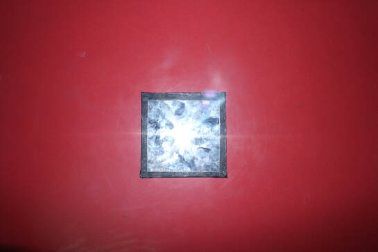
I continued my response to Magnani's work at home, where I was able to use cleaner mirrors and a much different environment, In my garden I was able to get nice reflections of nature.
WWW: At home I was able to use cleaner mirrors, which produced a higher quality image. I also liked the contrast given between the concrete ground and the image of nature in the mirror.
EBI: I could've managed lighting better by altering the ISO as in some images, the background came out dark, but the image in the mirror came out much brighter.
EBI: I could've managed lighting better by altering the ISO as in some images, the background came out dark, but the image in the mirror came out much brighter.
Reflection In Shapes and Colours
LINK ARTIST- Tamara Lorenz
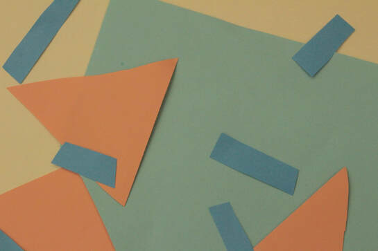
Tamara Lorenz is a German abstract artist. She uses a range of shapes and different contrasting and complementary colours. She uses quite irregular and abstract shapes as subjects of the work.
|
|
|
First Response & Gifs
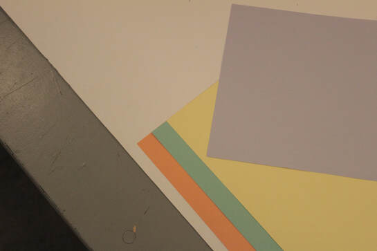
In class, I tried using a range of different and contrasting colours as well and different shapes to replicate the work of the artist. These shapes were made using coloured paper.
|
|
|
|
WWW: The lighting worked well and the use of tripods to stabilise the camera for the gifs improved them a lot.
EBI: Next time I could try using more abstract shapes.
EBI: Next time I could try using more abstract shapes.
Distorted Reflections.
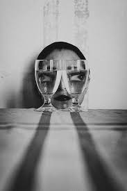
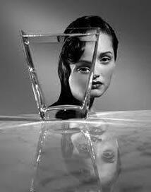
Antonio Guiterrez
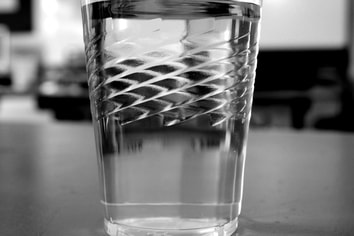
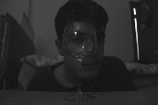
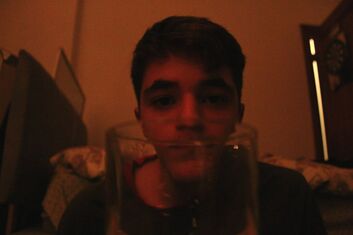
Antonio Guiterrez took various photos, where he would filled a clear glass full of water and place the glass partially infant of the subjects face, distorting it slightly. This works as light travels a bit slower in water causing the light to refract slightly and causing that part of the subjects face to look disproportional to the rest of their face. This gave quite an unsettling and disturbing final piece. A black and white filter was also used in order create a better and more disturbing atmosphere.
|
|
First Response.
We use glass bowls and other reflective surfaces in order to try and refract light to create a distorted image, much like the original images created by Gutierrez
WWW: I managed to capture some refractions
EBI: I wasn't really able to achieve the kind of response as I wanted as reflections were blurred and unclear. As well as this, light often reflected off the surface and ruined the photo too.
EBI: I wasn't really able to achieve the kind of response as I wanted as reflections were blurred and unclear. As well as this, light often reflected off the surface and ruined the photo too.
Edited to B&W:
|
|
|
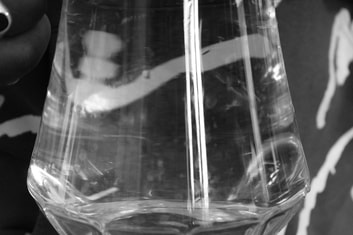
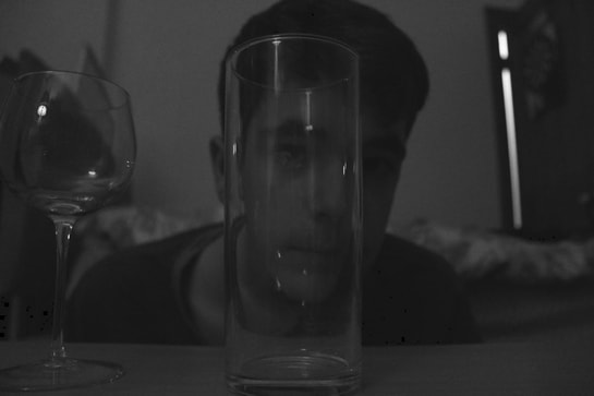
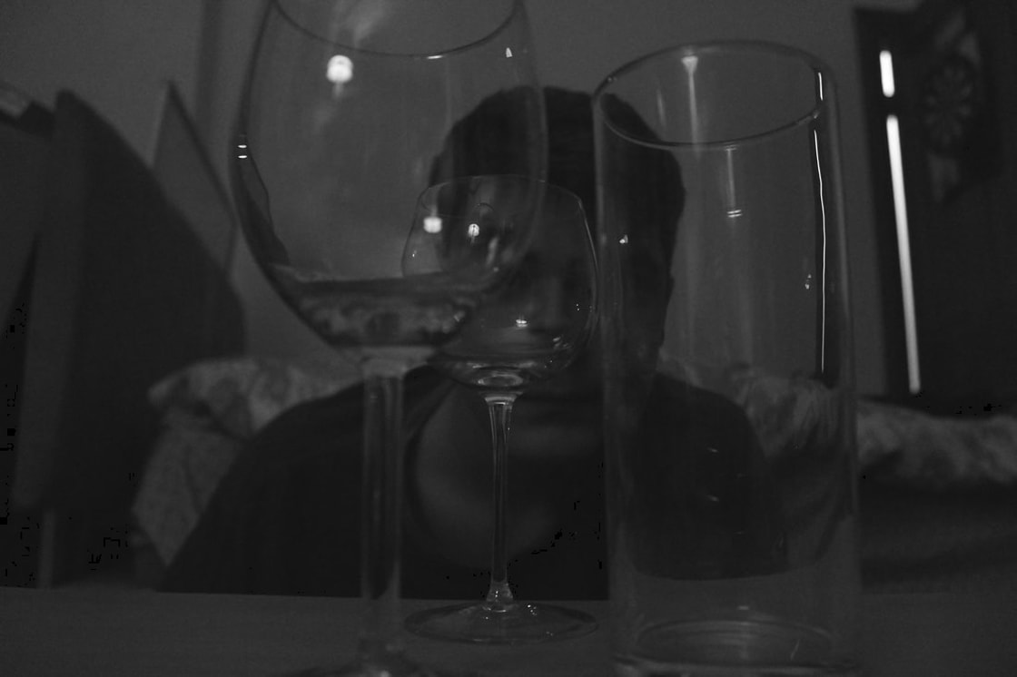
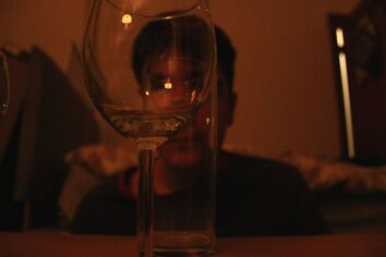
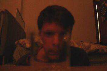
Homework Task.
In the homework task, we were asked to do the same at home. So I took my camera and tried out different angles to see different angles of distortion. I edited some of these later in photoshop to appear black and white.
|
|
WWW: Reflections were much clearer and reflected my original intentions
EBI: Lighting in some photos were a bit too dim, however at the same time, it could add to the artists original intents of a disturbing atmosphere. |
|
|
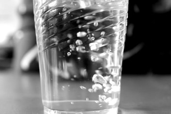
Refraction in Water
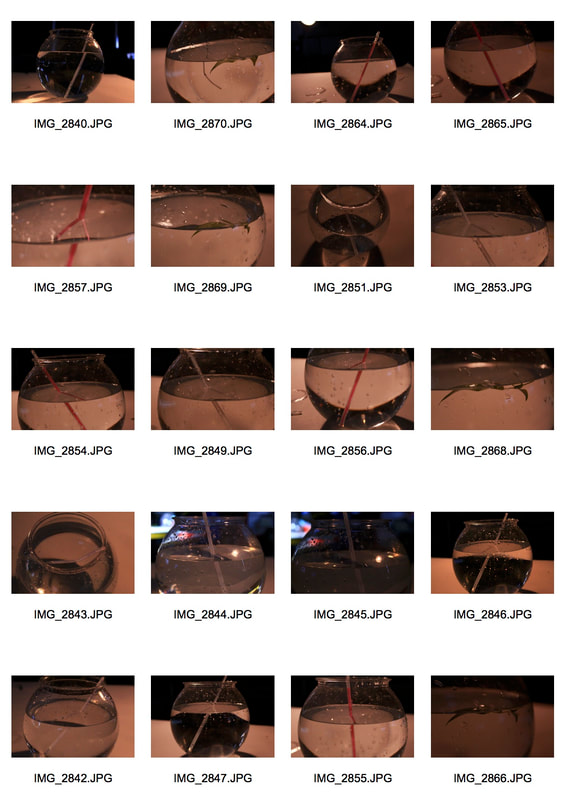
WWW:I was able to clearly a variety of different types of refraction in water, with different angles and positions.
EBI: The water droplets on the side of the bowl sometimes ruined the shots, making them less immersive and look overall worse. Next time I should try to dry the droplets somehow.
EBI: The water droplets on the side of the bowl sometimes ruined the shots, making them less immersive and look overall worse. Next time I should try to dry the droplets somehow.
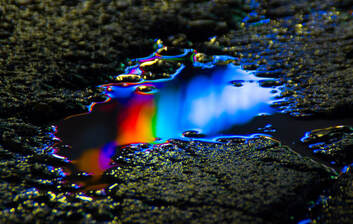
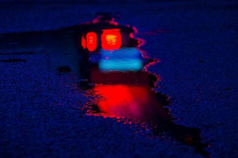
Reflections on Water
Link Artist - Slava Semeniuta
|
|
|
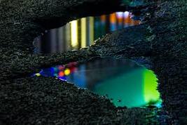
Slava is a Russian born photographer / artist. She says to have been inspired by 'neon' colours, colours that are rare to find naturally. As seen in her reflection work, she photographs reflections of fluorescent lighting in puddles out on streets. The background for most of these shots are usually urban, nighttime settings. I think the contrast between the colourful lights and dark night setting works quite well as it draws audiences' attention to the main point of the photo.
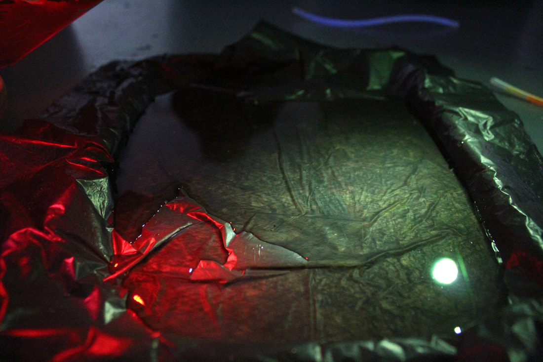
First Response
Slideshow-
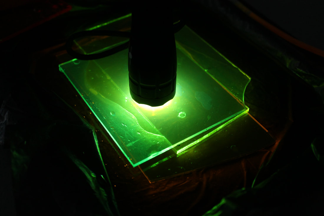
For our first response, we attempted to recreate the images in a classroom setting. A black nylon bag was used to establish a dark, urban style background with a pool of water in the middle. We used a range of translucent plastic tiles to create the colourful neon lights used in the artist's original work.
In essence, we used a torch as a light source, and placed a translucent plastic tile in front of it to change the colour of light to a more neon-ish colour.
In essence, we used a torch as a light source, and placed a translucent plastic tile in front of it to change the colour of light to a more neon-ish colour.
|
|
WWW: I managed to capture the effect of 'neon' or colourful lighting quite well
EBI: Next time I should be more careful about whats in the photo as some objects got in the way
EBI: Next time I should be more careful about whats in the photo as some objects got in the way
Second Response - GiF
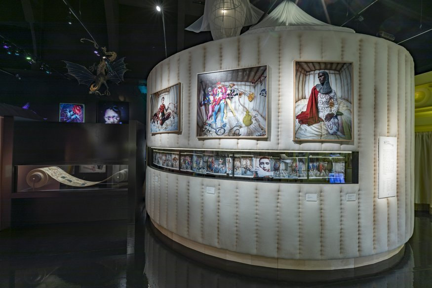
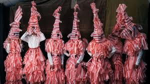
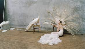
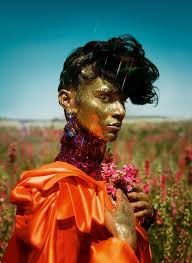
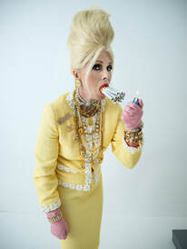
TIM WALKER - V&A
|
|
|
This is an exhibition of Tim Walker's work, a creative and inventive fashion photographer.
|
|
Walker's work focuses on the abstract and abnormal, usually photographing the obscure which can spark interest or conversation in the audience. This gets the audience to think a bit more about what they are looking at and think of a deeper meaning.
As mentioned, Tim Walker's strange choice of subjects to photograph, is quite a good thing in my opinion as it makes his work unique and stand out. In my opinion I like the wide variety in his shots as some photos are colourful, rich and complex, while others are relatively more simple yet carry the same idea and style.
As mentioned, Tim Walker's strange choice of subjects to photograph, is quite a good thing in my opinion as it makes his work unique and stand out. In my opinion I like the wide variety in his shots as some photos are colourful, rich and complex, while others are relatively more simple yet carry the same idea and style.
3 STRANDS
3 Strands : REFLECTION OF AMBIENT LIGHT
Link Artist - Slava Semeniuta
As mentioned, Slava is a Russian born photographer / artist. She says to have been inspired by 'neon' colours, colours that are rare to find naturally. As seen in her reflection work, she photographs reflections of fluorescent lighting in puddles out on streets. The background for most of these shots are usually urban, nighttime settings. I think the contrast between the colourful lights and dark night setting works quite well as it draws audiences' attention to the main point of the photo.
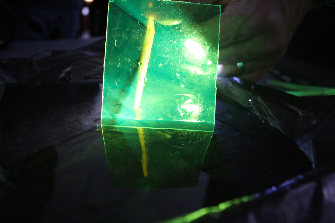
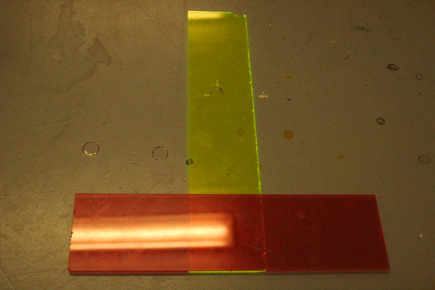
Here I took inspiration from her style of photographing 'neon' coloured lights and applied this to reflections in water, in the darkness. Essentially, we took translucent coloured plastic and shone a torch behind it, trying to get a reflection in the water too.
As mentioned, Slava is a Russian born photographer / artist. She says to have been inspired by 'neon' colours, colours that are rare to find naturally. As seen in her reflection work, she photographs reflections of fluorescent lighting in puddles out on streets. The background for most of these shots are usually urban, nighttime settings. I think the contrast between the colourful lights and dark night setting works quite well as it draws audiences' attention to the main point of the photo.
Here I took inspiration from her style of photographing 'neon' coloured lights and applied this to reflections in water, in the darkness. Essentially, we took translucent coloured plastic and shone a torch behind it, trying to get a reflection in the water too.
You can see that the water causes the reflection of the coloured plastic to refract, giving the illusion of the plastic bending.
Best 3:
|
You can see here the image of the plastic being refracted and reflected very clearly in the water.
|
WWW: The main objects of the photo came out clear and focused. I also liked my use of change in focus in the photos, where one part is in focus and the other out.
EBI: The lighting could've been brighter as the setting of the photo is unclear, e.g. whether or not it is in water.
EBI: The lighting could've been brighter as the setting of the photo is unclear, e.g. whether or not it is in water.
Light development
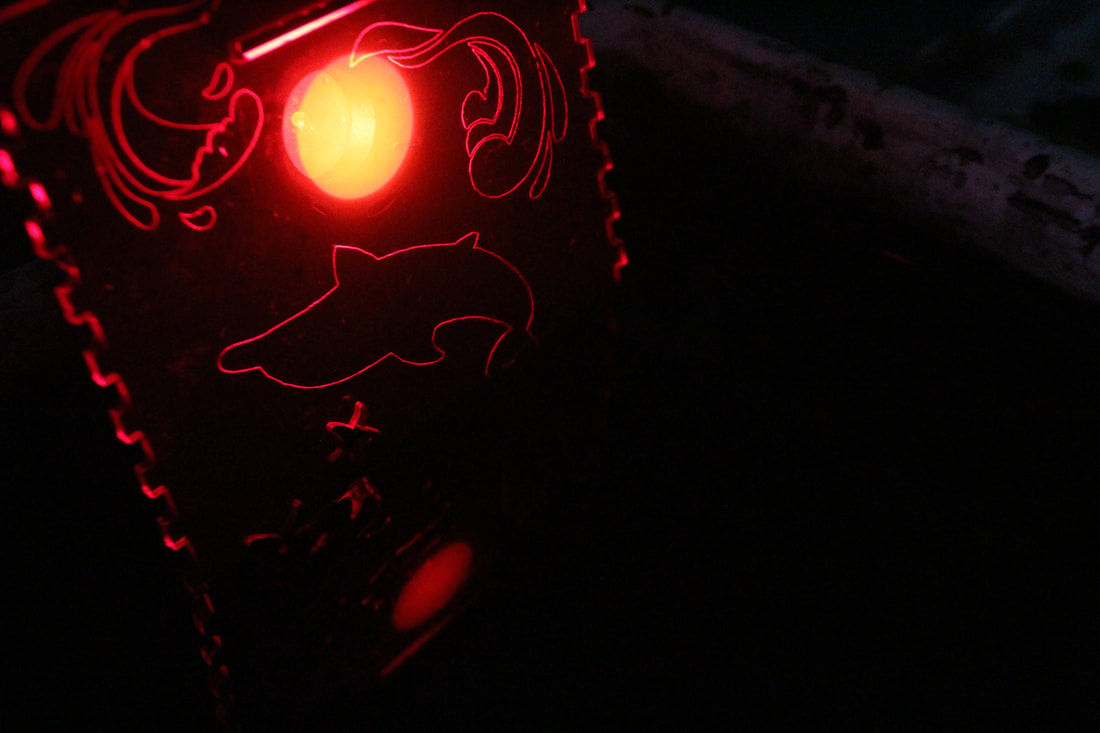
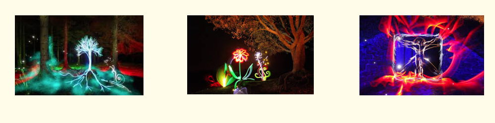
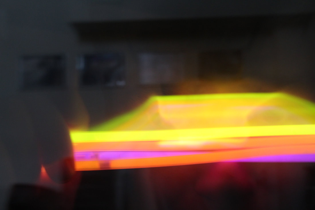
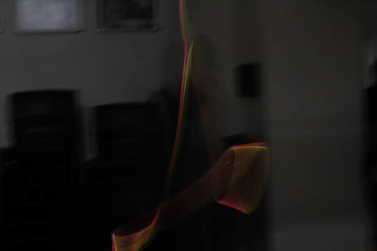
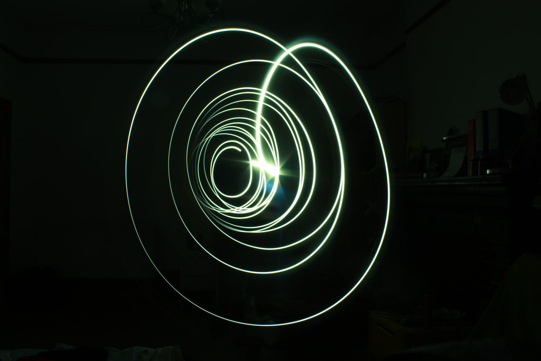
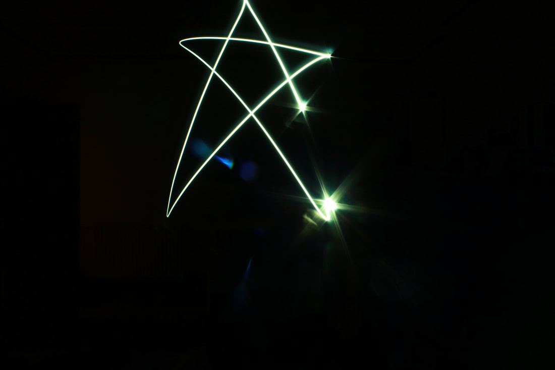
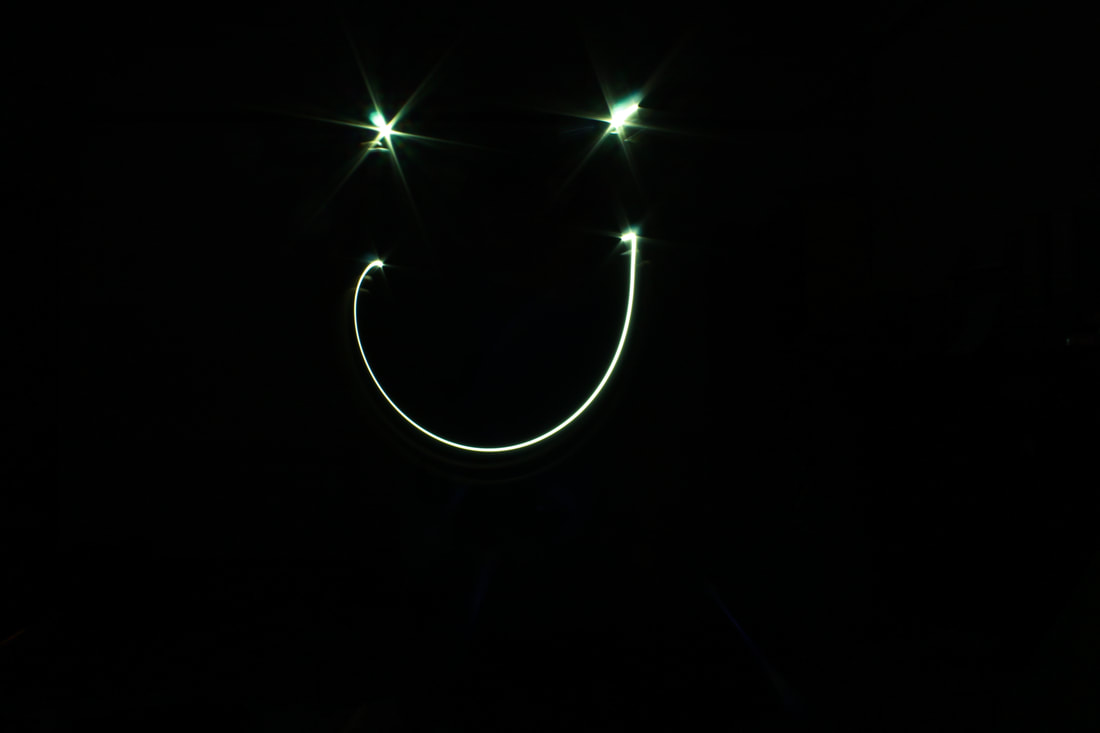
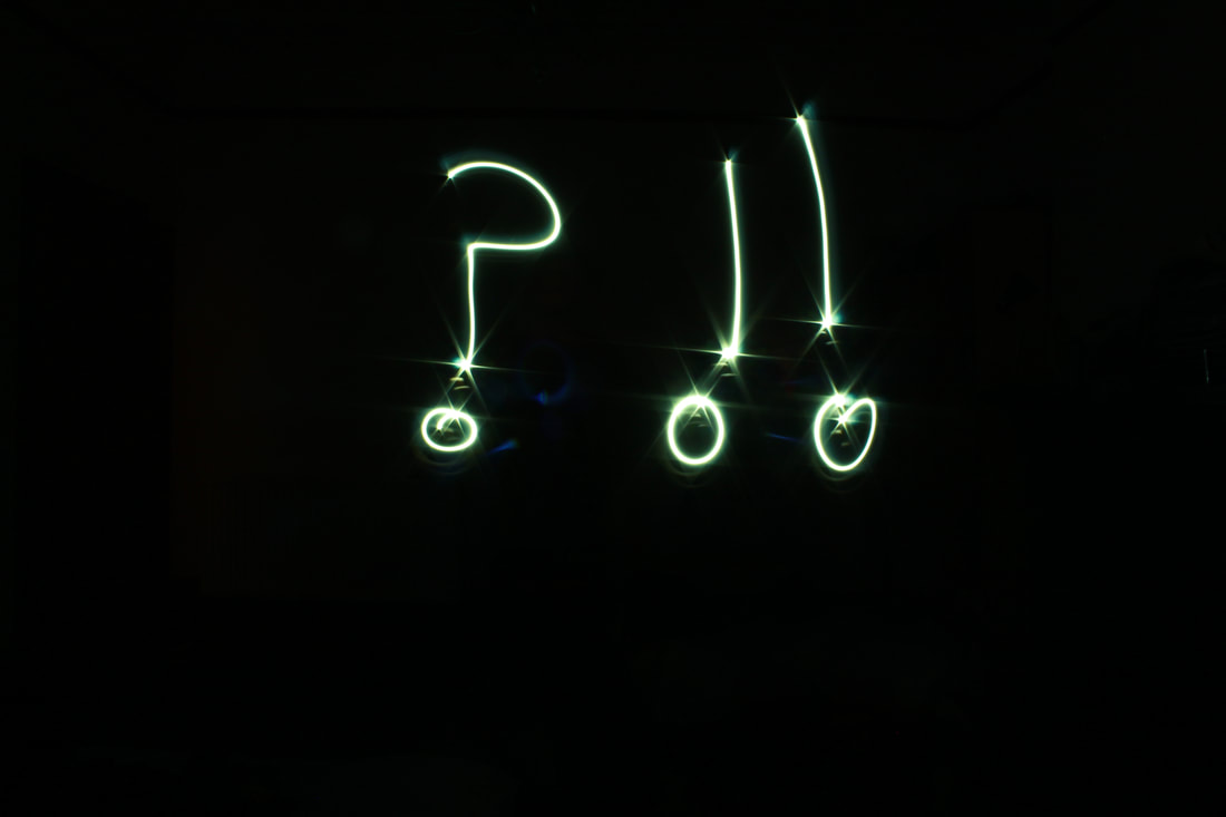
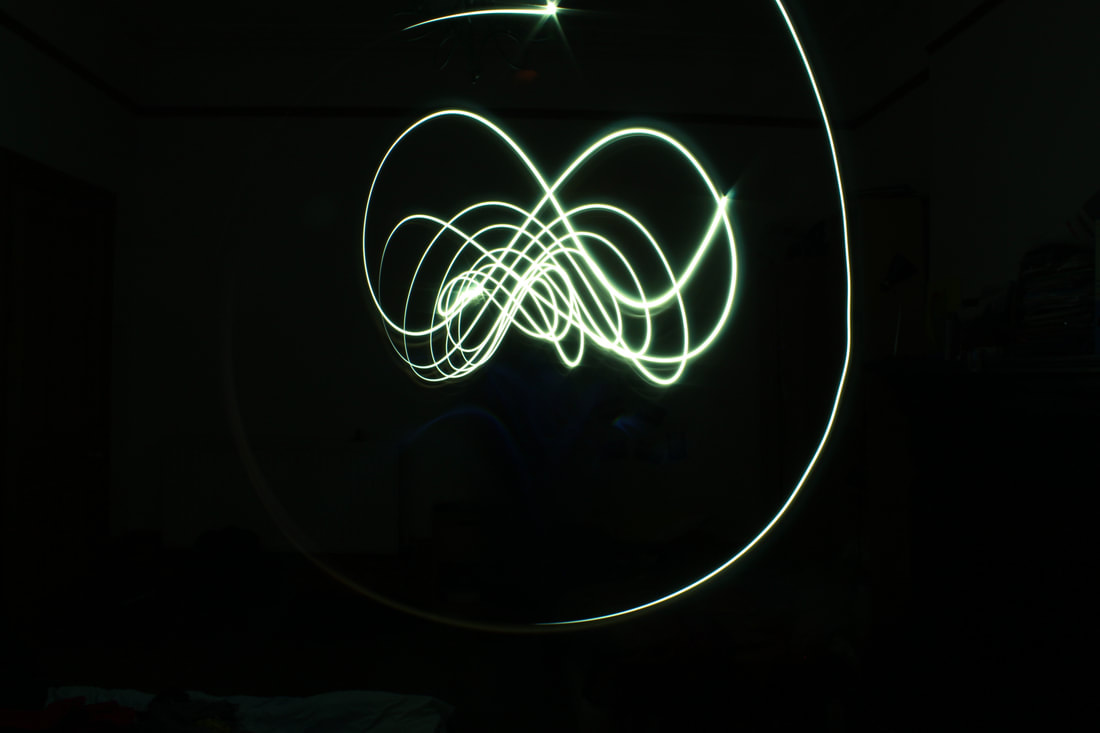
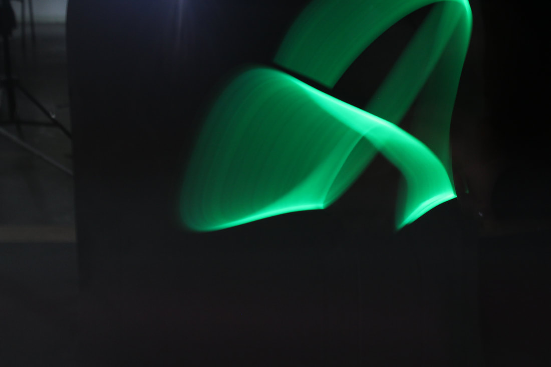
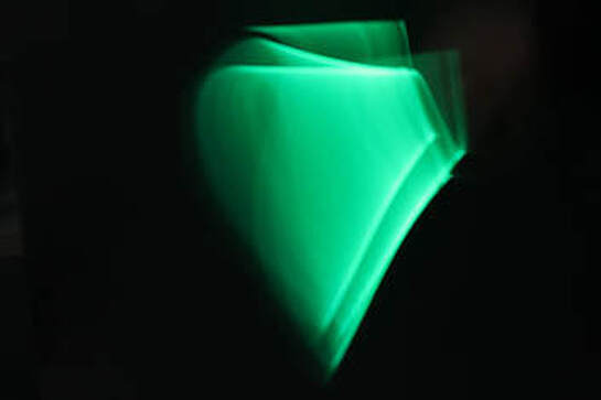
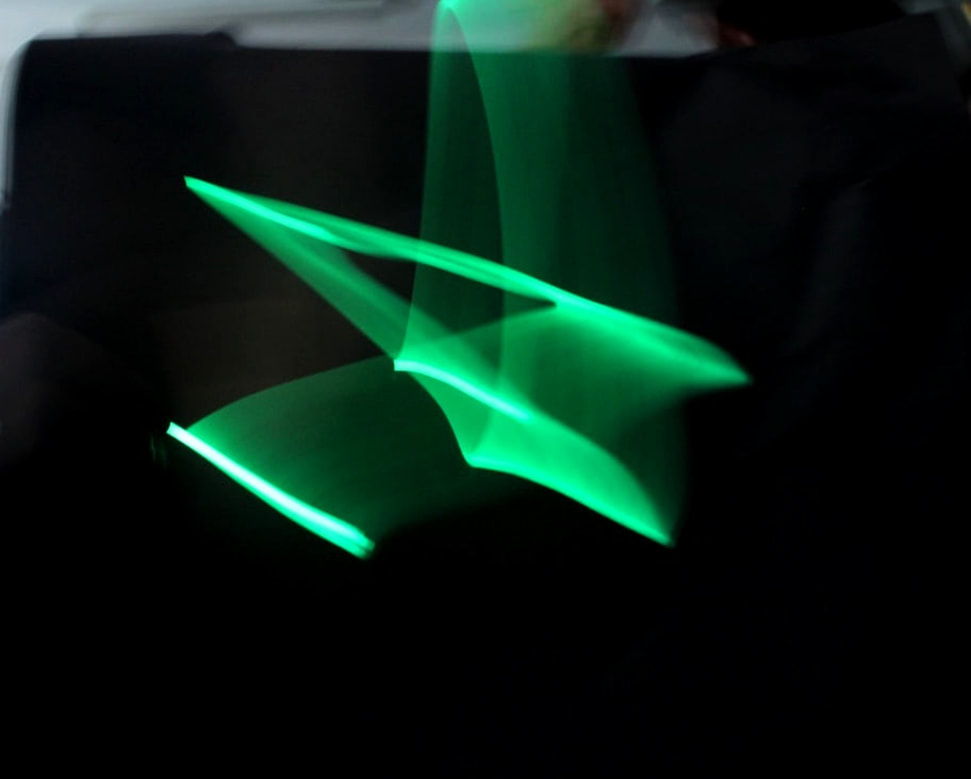
Light PaintingIn this task, using a torch/ glow stick, I was required to make drawings from light. This is done by having long shutter speed (like 10", or using 'bulb' mode), meaning the movements of light could be tracked by the camera. In order to counter act the long light exposure we would use a large F stop (smaller aperture) like F13, and have a very low ISO number such as 100. A tripod is also essential to have so that the photo does not become blurred. This is because, at that kind of long shutter speed, any slight movements can cause the image to blur dramatically.Micheal Bossanko.The link artist for this topic is Micheal Bossanko. He uses this technique to paint pictures that are both whimsical and surreal by using colourful lights to create beautiful and creative images.
|
|
|
|
|
|
|
|
|
|
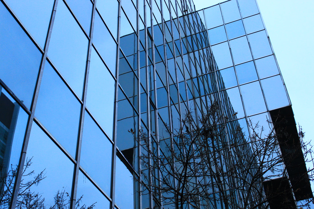
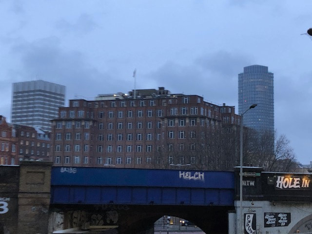
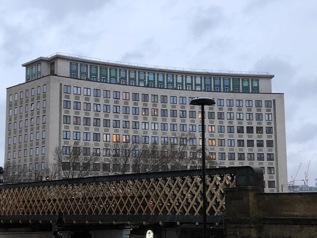
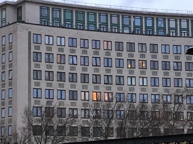
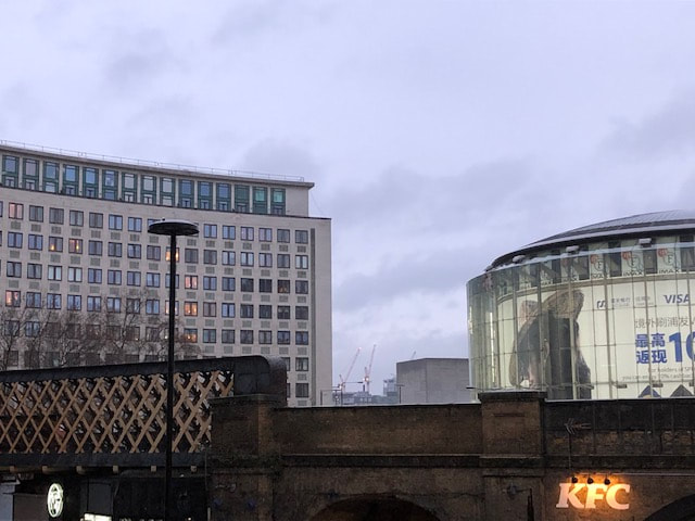
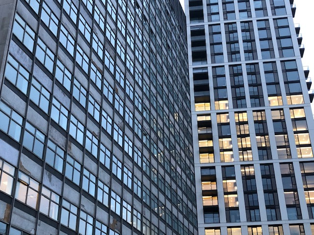
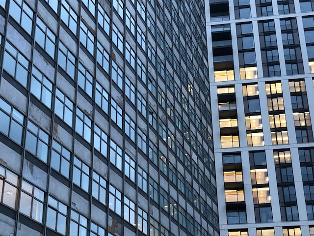
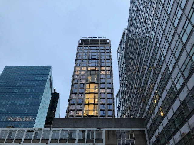
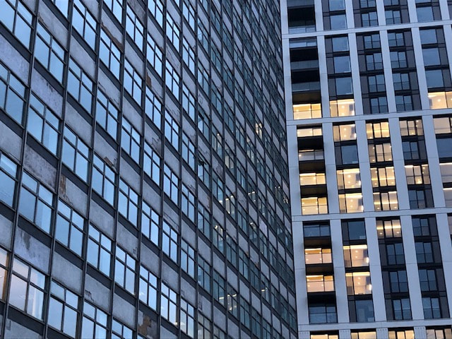
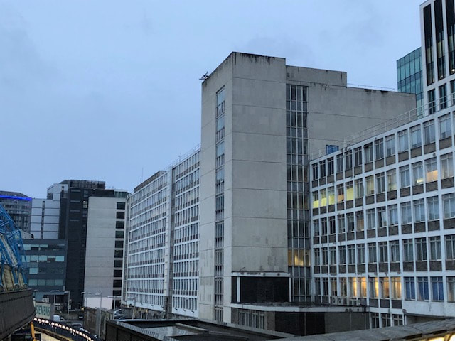
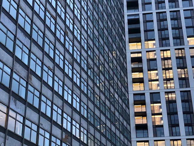
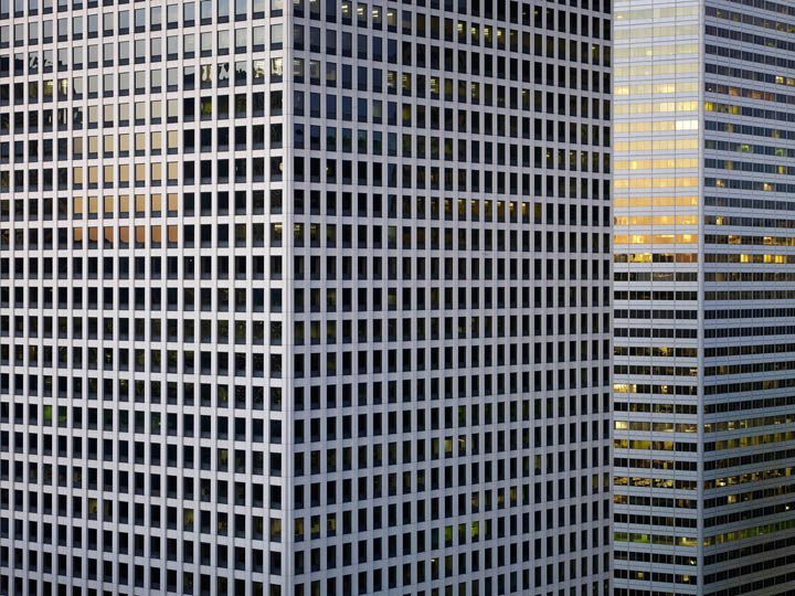
Strand 2: REFLECTION IN BUILDINGS
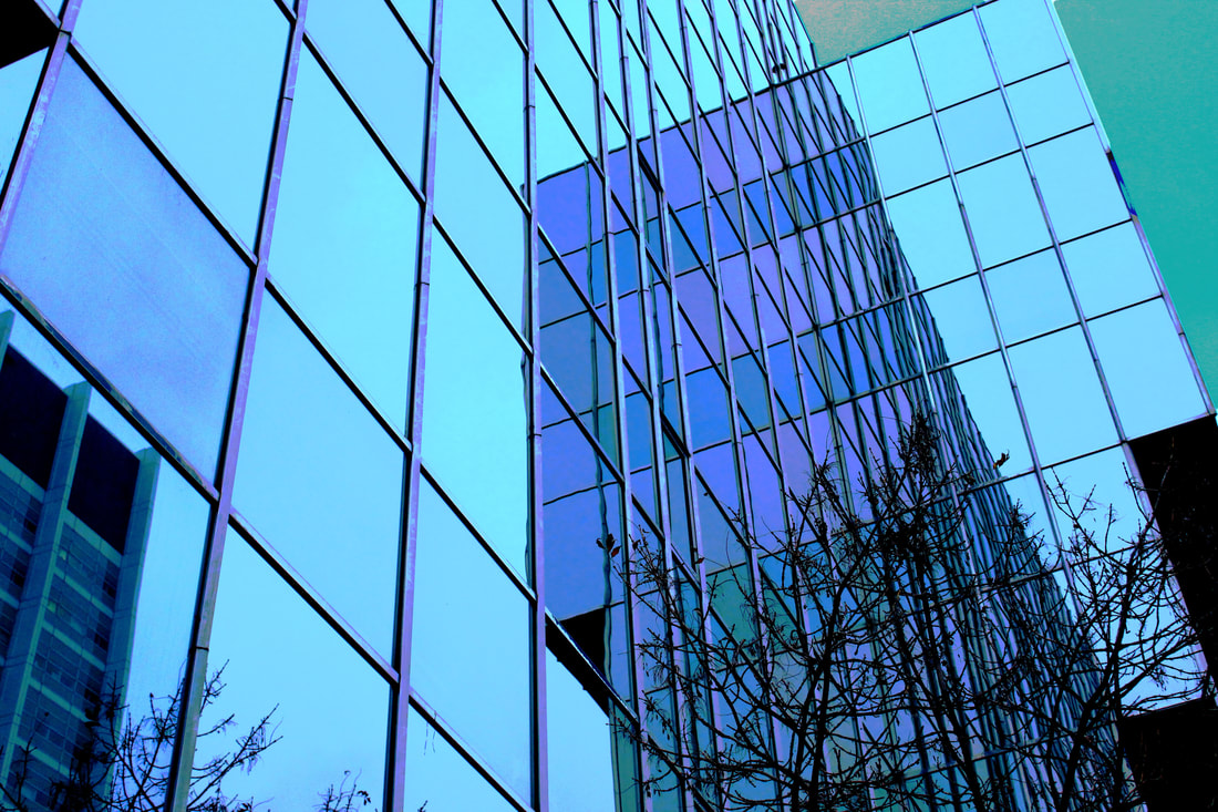
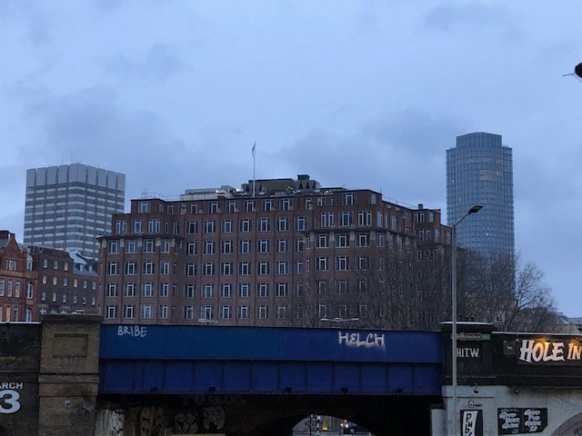
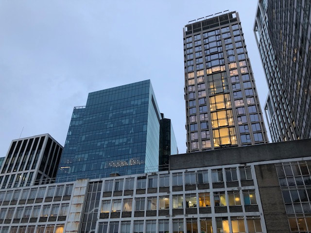
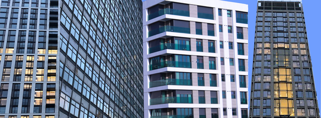
I went round various places in London AND New York to photograph pictures of the variety of buildings there, mainly aiming to capture the different reflections I can get from the faces of these buildings.
Developed...
|
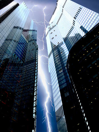
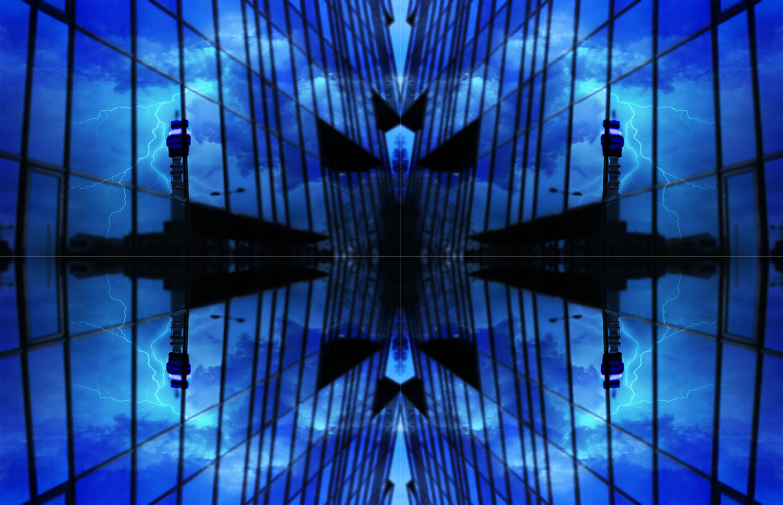
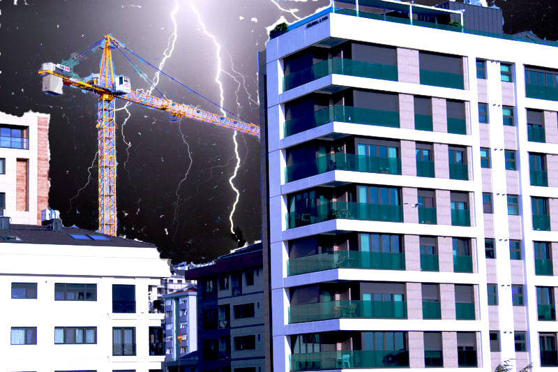
In this piece, I chose to layer a google image of lightning in the background of the shot to make the image more eye catching and spectacular to the audience.
|
|
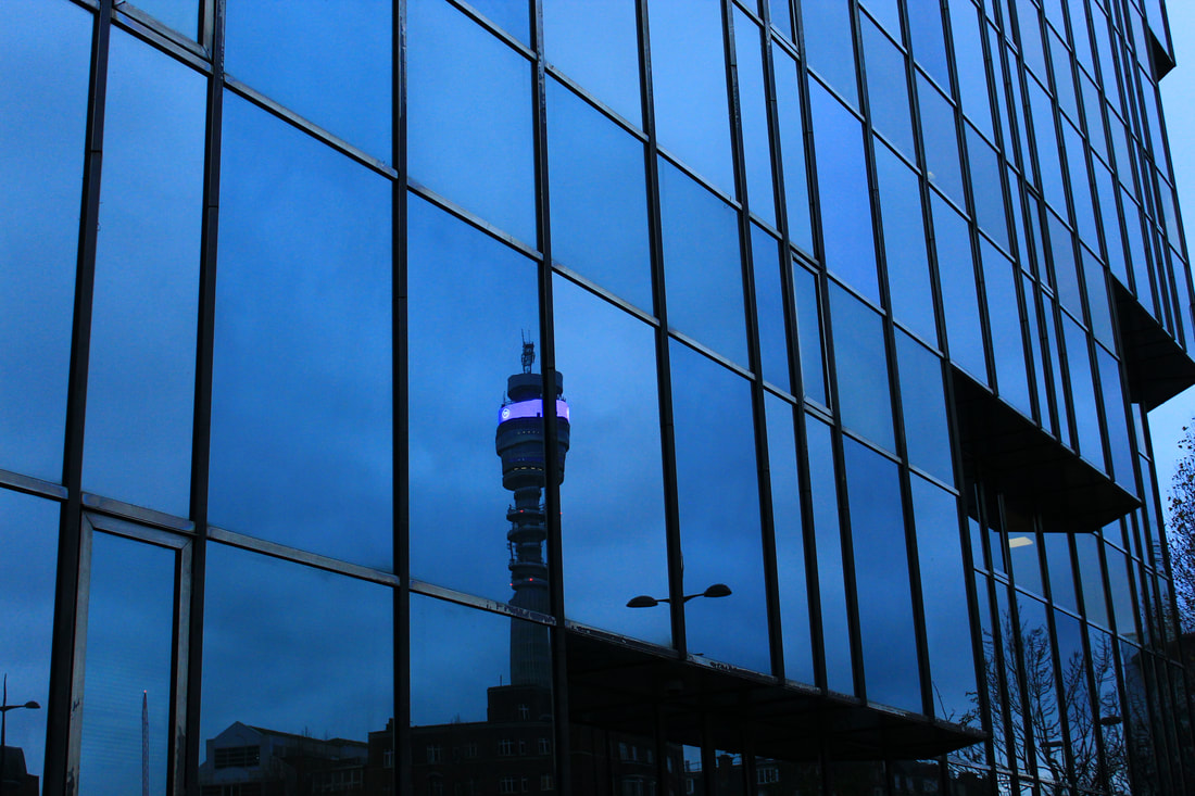
WWW: I managed to get photos of a lot of different types of buildings and in some of these, the reflections were extremely clear. As well as this, the mixture of different weather conditions created a nice variety of different shots.
EBI: Some reflections didn't show much of an interesting image in the reflection.
EBI: Some reflections didn't show much of an interesting image in the reflection.
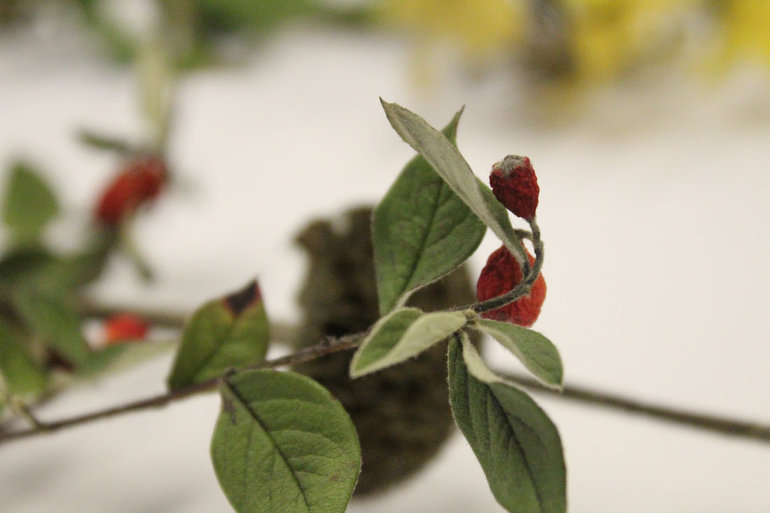
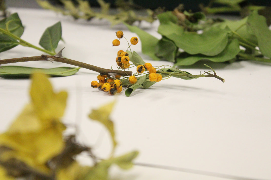
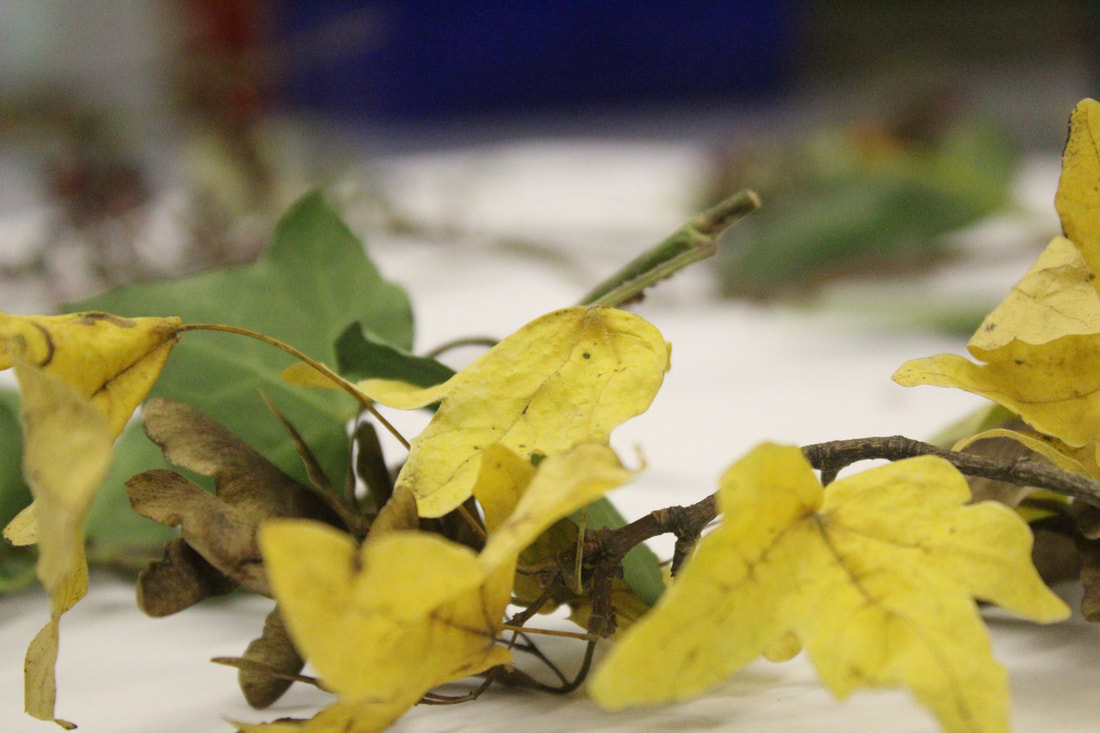
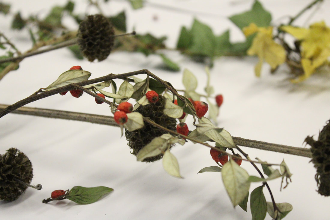
Strand 3: Reflection of Nature
Link Artist...
First Response
WWW: I really liked my use of focus blur as it worked well in highlighting the main object I was photographing.
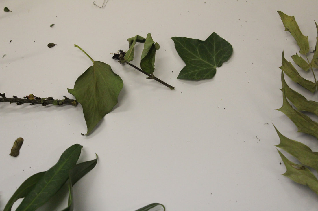
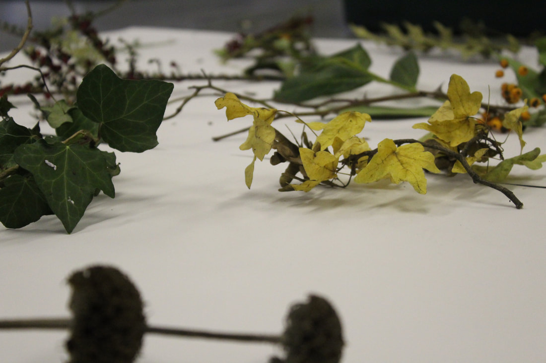
Developed...
|
|
WWW: I really liked my use of focus blur as it worked well in highlighting the main object I was photographing.
EBI: I think for some of the photos the lighting was a little dark, however this can be fixed by after shoot edits or using a higher ISO setting.
EBI: I think for some of the photos the lighting was a little dark, however this can be fixed by after shoot edits or using a higher ISO setting.
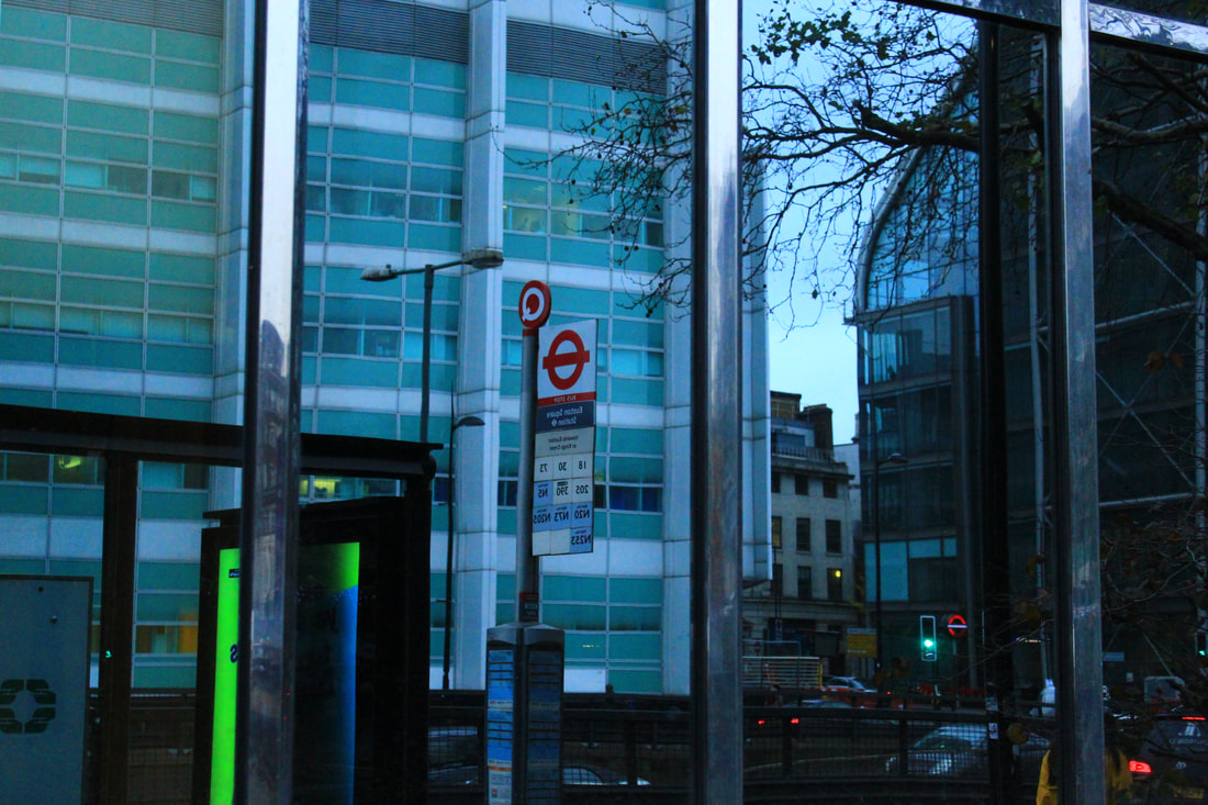
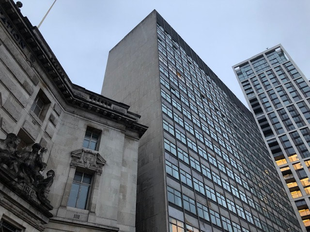
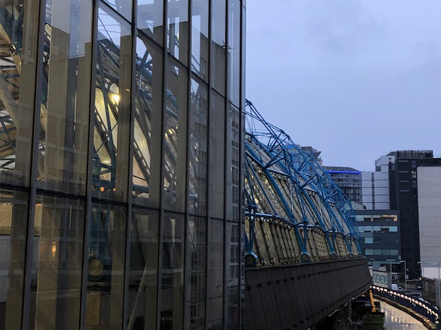
Three Strands development: REFLECTIONS IN BUILDINGS
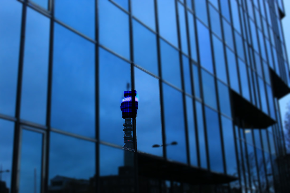
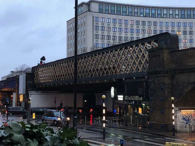
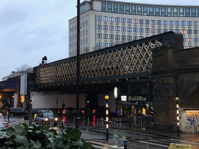
I have decided to choose the 'Reflections In Buildings' strand to develop. In these images below, I went to Euston and Warren Street in London to take various photos of the city as seen reflected in the glass of various buildings in the area. I chose in particular, buildings made of glass that gives a clear reflection of the surroundings.
Best 3:
|
|
|
Edited in Photoshop:
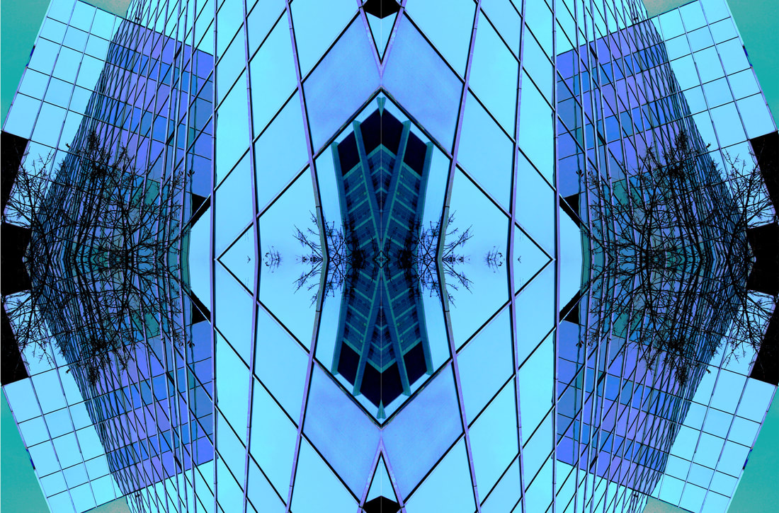
I have chosen to develop the following photos as I thought they were my best photos. Essentially, I have edited these images by changing the tones, colours and saturation of each picture, sometimes adding blur or other various edits. Then I have either mirrors the images or overlaid them on top of one another (as shown below).
|
|
|
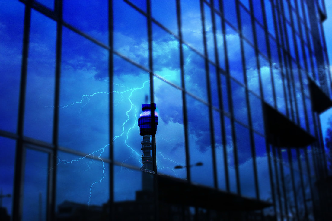
Using an image of lighting simply off of google and putting it into photoshop, I was able to over lay an image of lighting to appear as a reflection in a building.
|
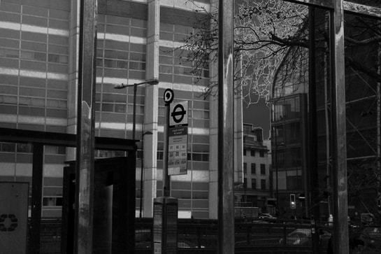
Bus stop as seen reflected in a building in B&W
|
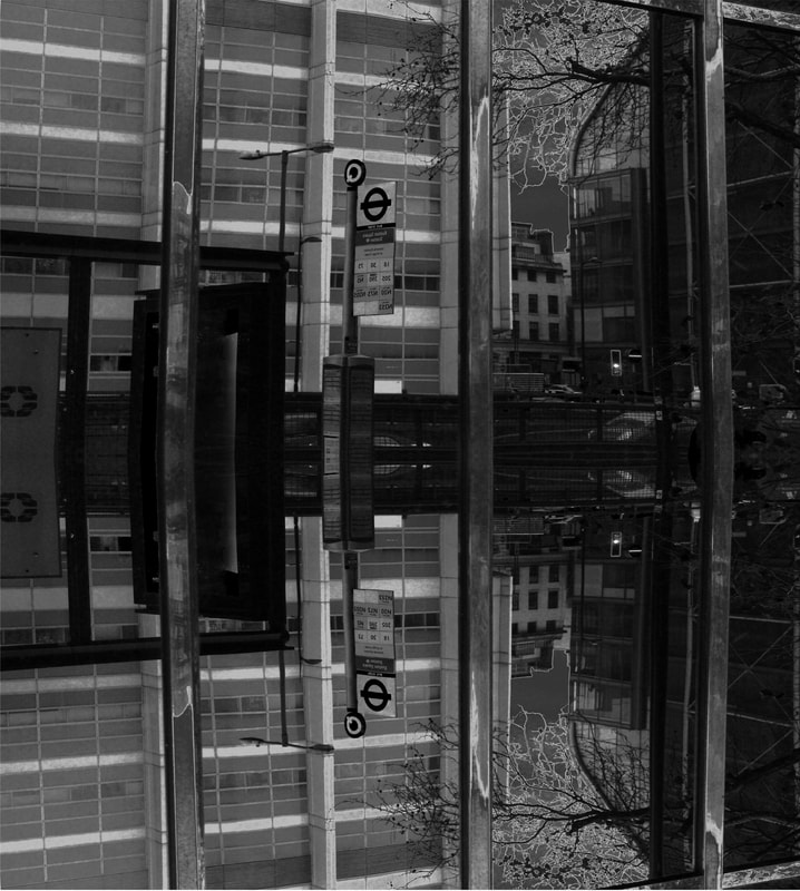
Image of bus stop mirrored vertically.
|
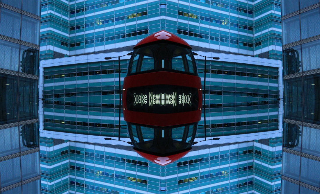
Image of bus, mirrored 4 times in photoshop.
WWW: I liked how the reflections appeared very clearly in the buildings. For the final piece, I liked how the edits comes off very well, the overlaying of the images of lighting worked very smoothly and I was very pleased about how realistic the image came out. I also quite liked how well the mirroring of the images came out in the final pieces.
EBI: On one of the final pieces, the image did not get flattened properly, which meant that the image had small gaps in between the reflections.
EBI: On one of the final pieces, the image did not get flattened properly, which meant that the image had small gaps in between the reflections.
How I did it...
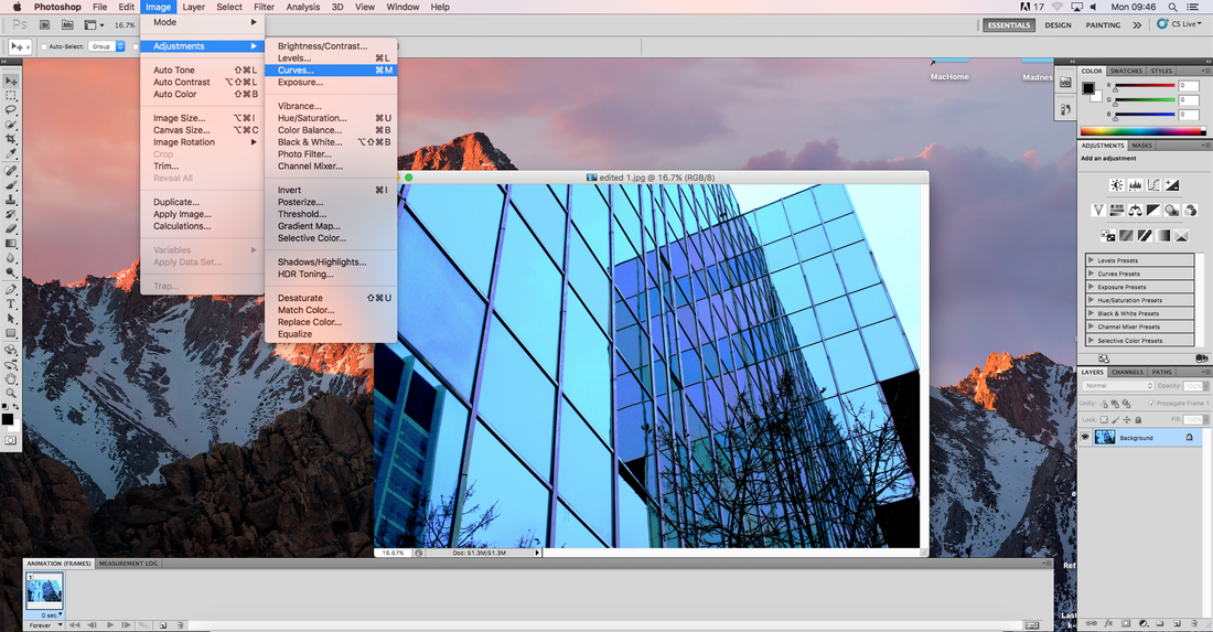
First I edited the 'Levels', brightness and overall colours of the photograph
|
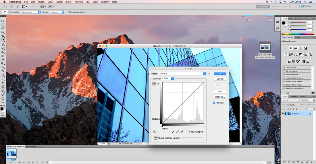
Next using the 'Curves' tool, I was able to change layers of colouring in different parts of the photo, giving vibrant and interest contrasts and colours.
|
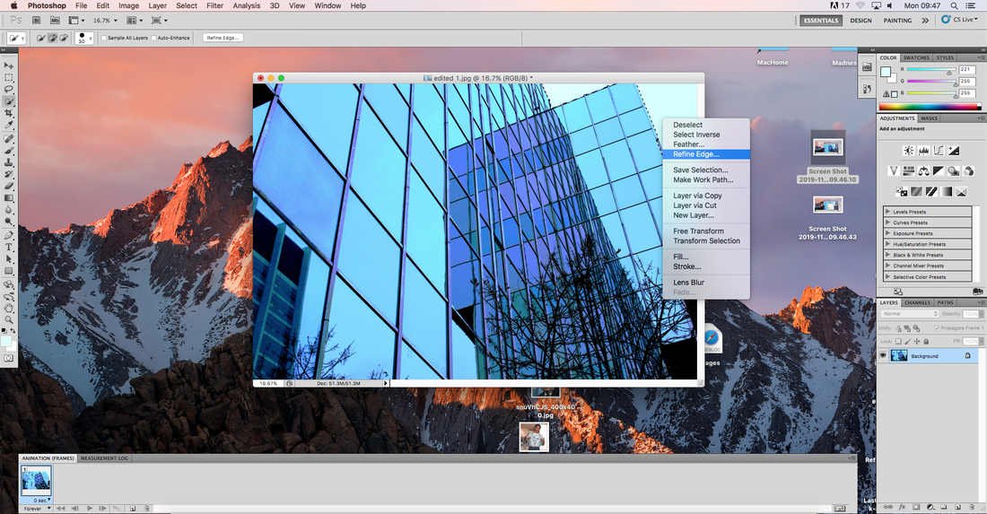
Next I using the quick select tool, I selected a specific area of the photo I wanted to alter, in this case the sky.
|
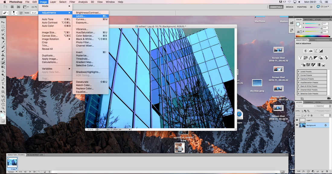
|
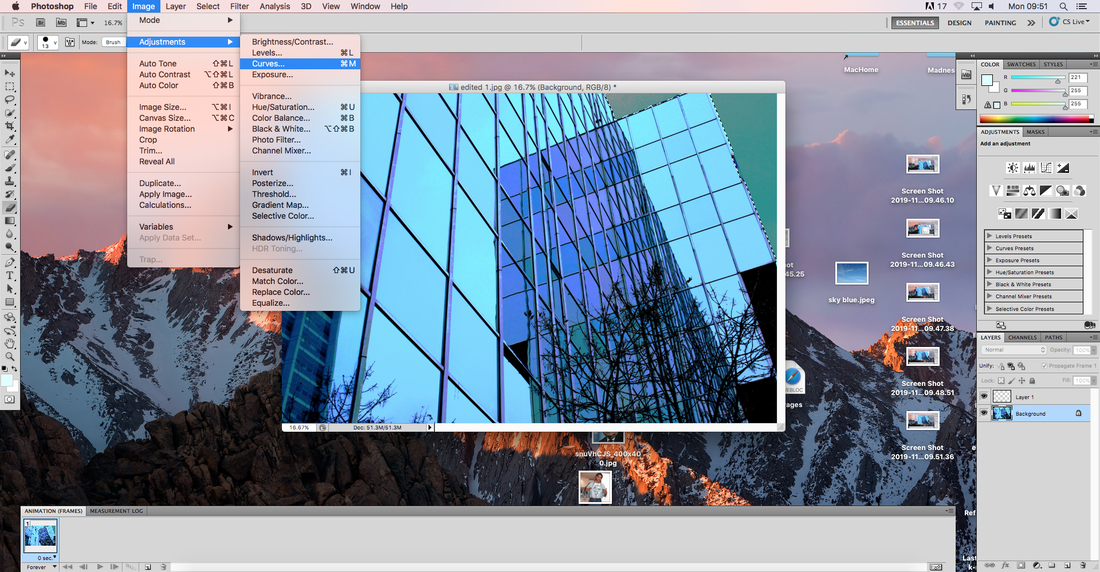
Once again, using the 'Curves' and 'Levels' tools, I changed the background of the image to give a surreal look.
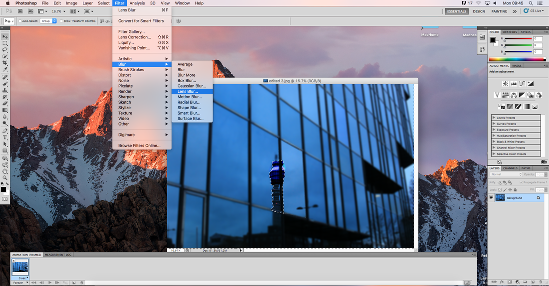
In this image, this time I used the quick select tool to separate the tower and the rest of the image. After doing this I used the 'pixelate' tool to pixalise the tower in order to once again give a surreal look. Then I chose to use a lens blur effect on the rest of the image.
Mirroring of Images in Photoshop
Overlaying of Images in Photoshop...
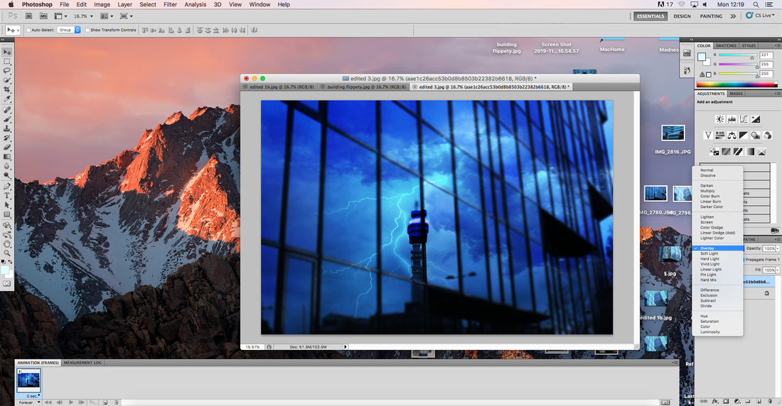
I was able to overlay an image of lightning onto a picture I took by first, covering the original image completely by the picture of lighting, then selecting the 'Overlay' option.
Overall...
I am quite happy with how these images turned out as I believe they show the reflections in buildings that I wanted to portray. The edited finals, I especially like as I was able to create surreal, interesting combinations of my perception of reflection of buildings. In particular, what I like about my edits is that some of them look quite realistic, yet so surreal and supernatural.
I am quite happy with how these images turned out as I believe they show the reflections in buildings that I wanted to portray. The edited finals, I especially like as I was able to create surreal, interesting combinations of my perception of reflection of buildings. In particular, what I like about my edits is that some of them look quite realistic, yet so surreal and supernatural.
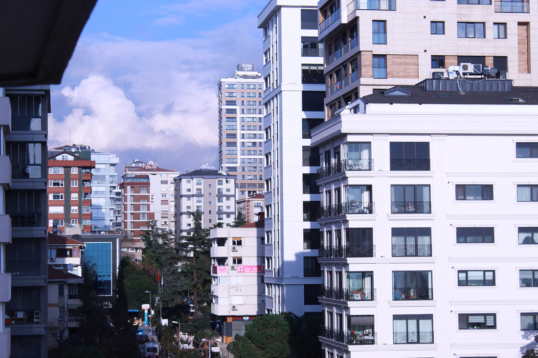
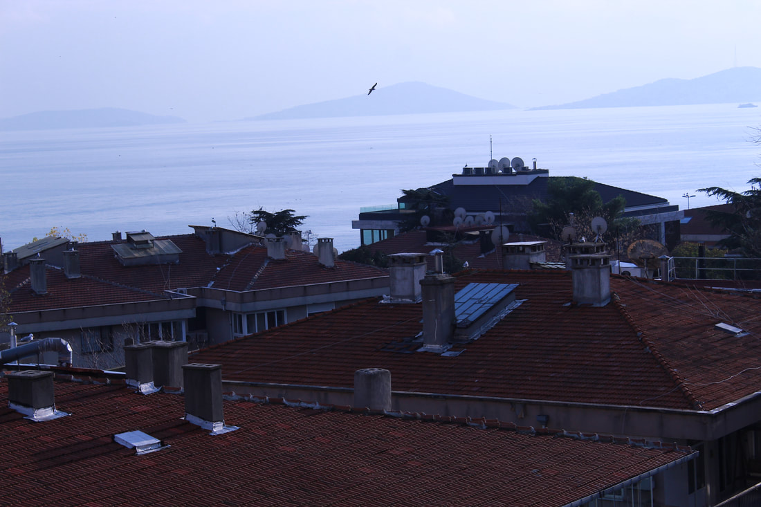
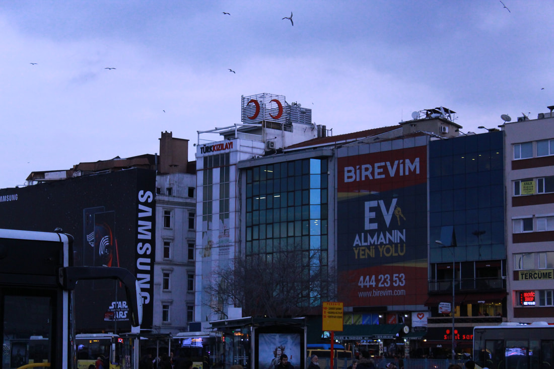
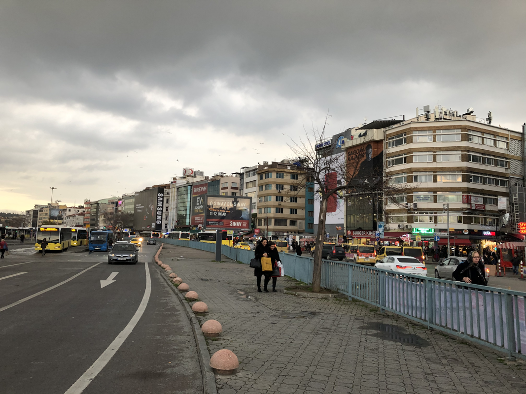
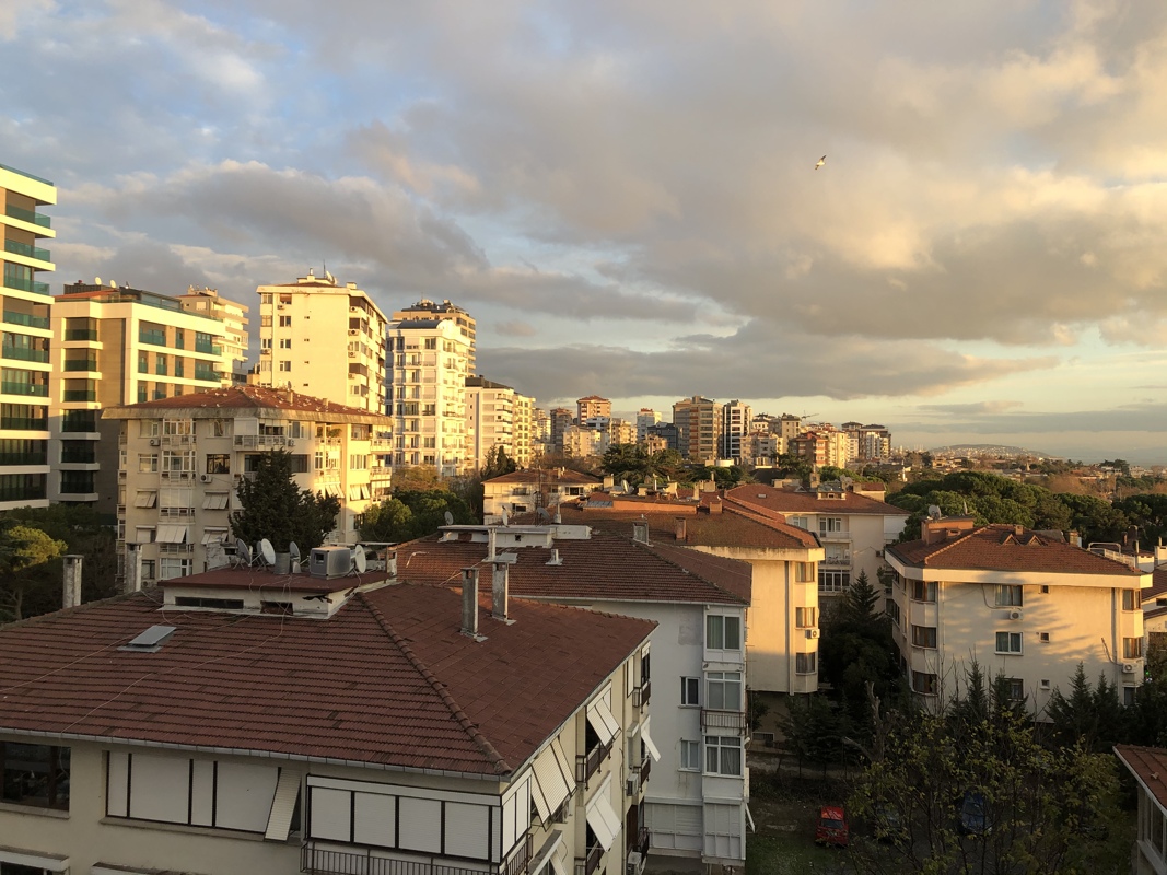
Strand Development II - Reflection In Different Cities
In this section, I travelled to Istanbul, Turkey and compared the buildings in this city with London's. I focused more on the structure and style of the buildings, as opposed to the literal reflections in these buildings as I did in the first part of the final strand.
I found it quite enjoyable and interesting to contrast the two very architecturally and culturally different cities
I found it quite enjoyable and interesting to contrast the two very architecturally and culturally different cities
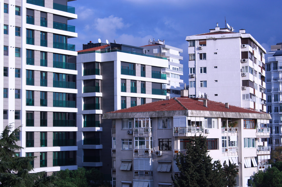
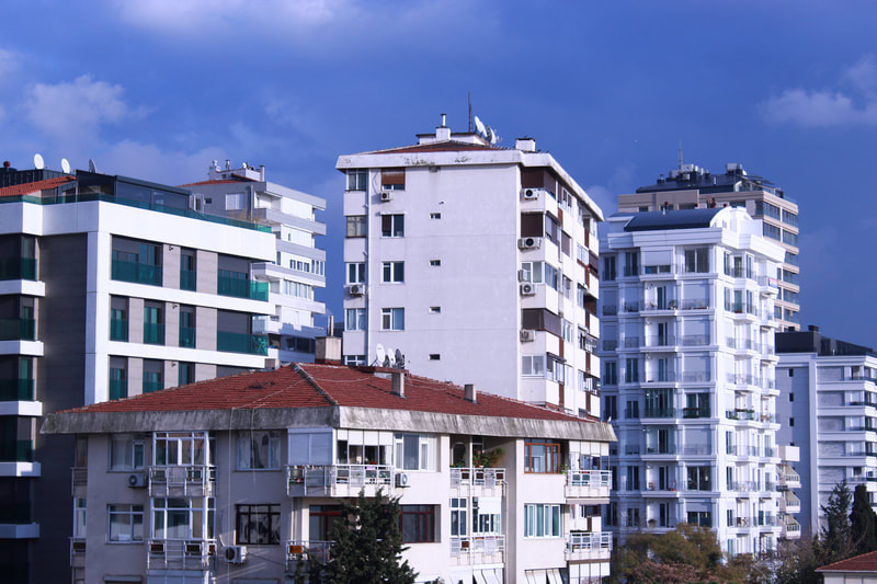
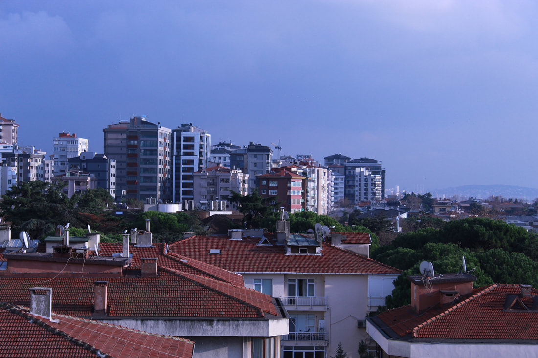
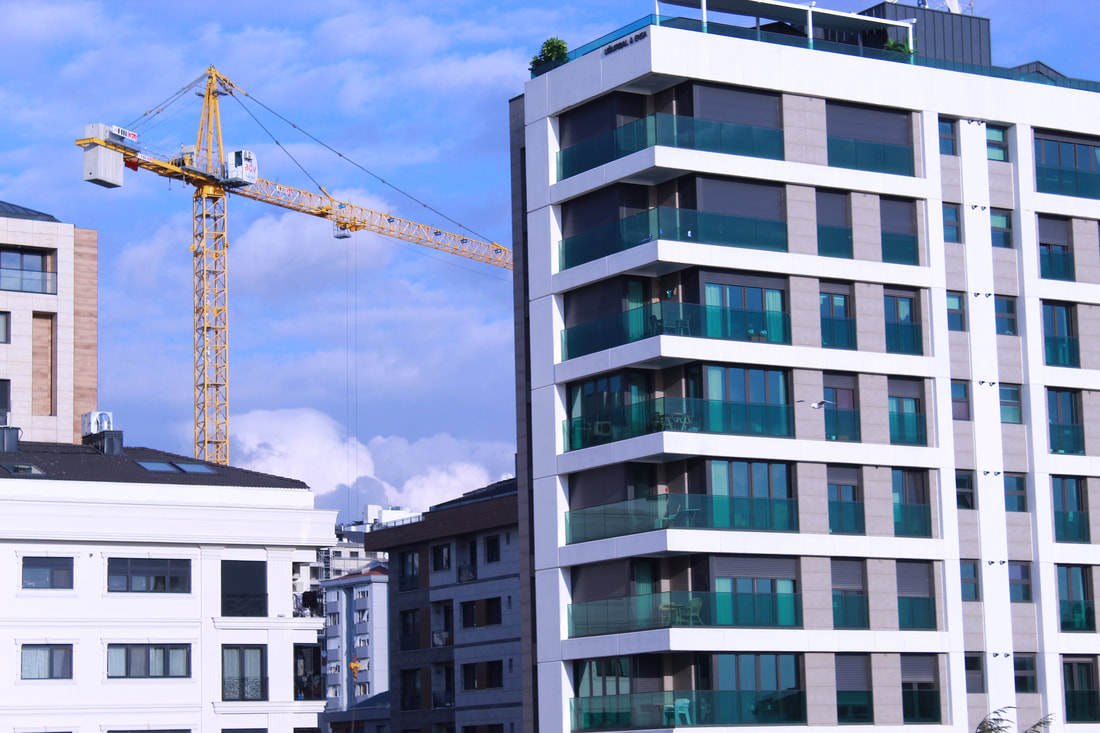
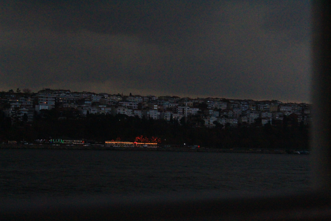
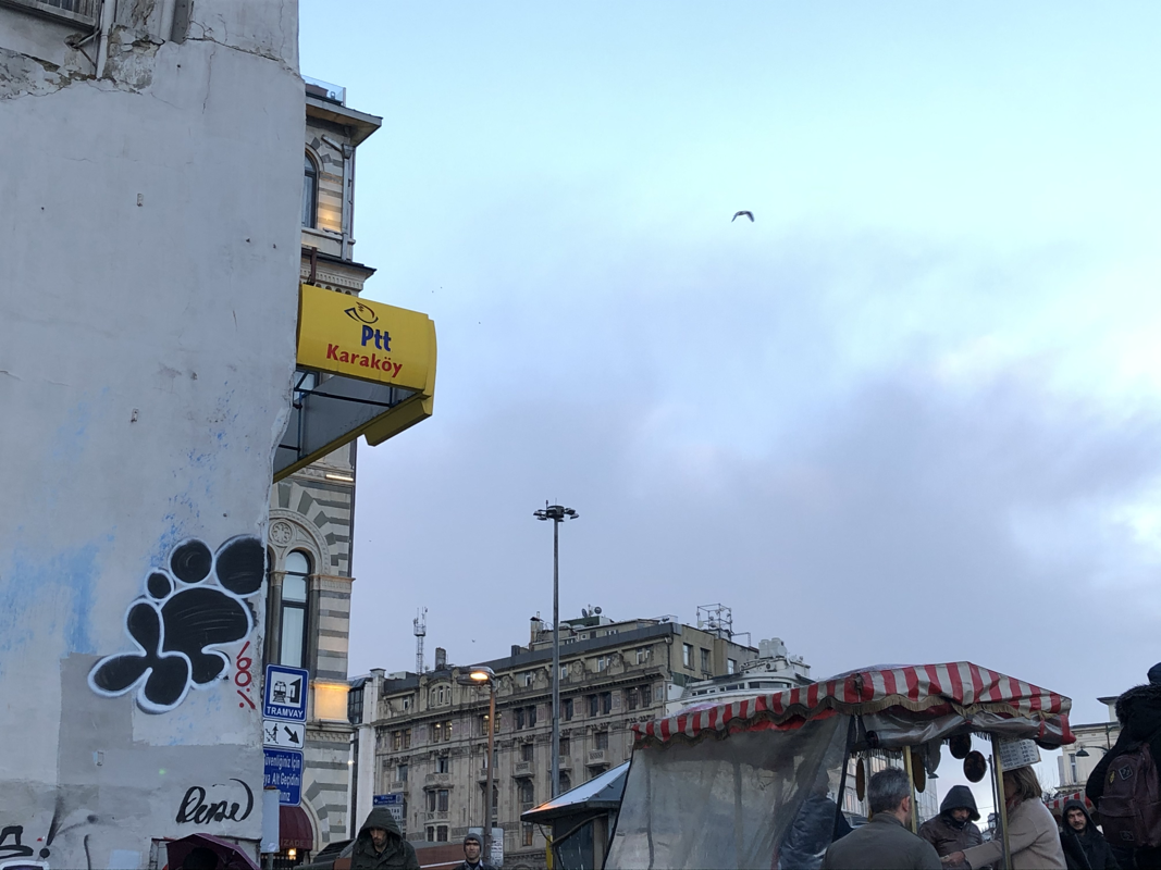
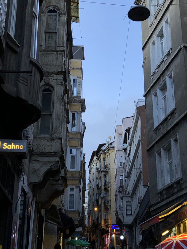
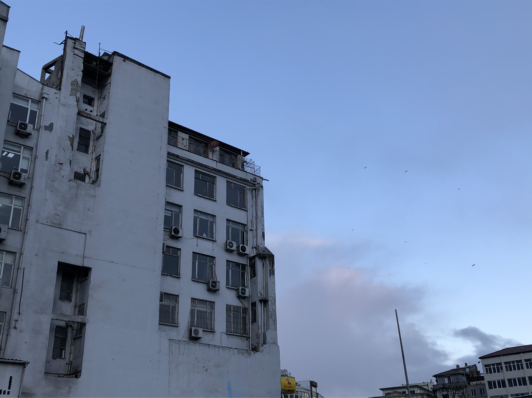
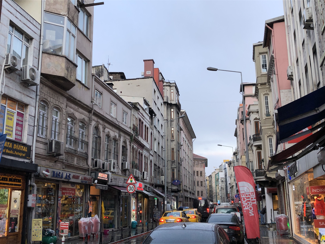
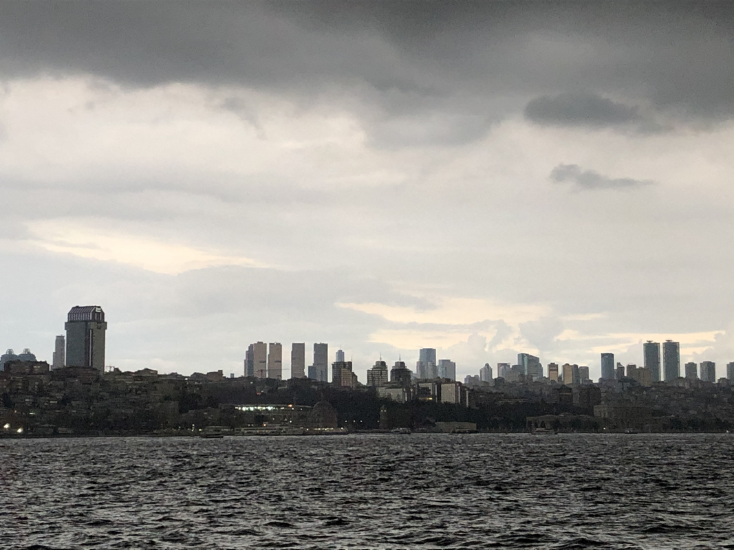
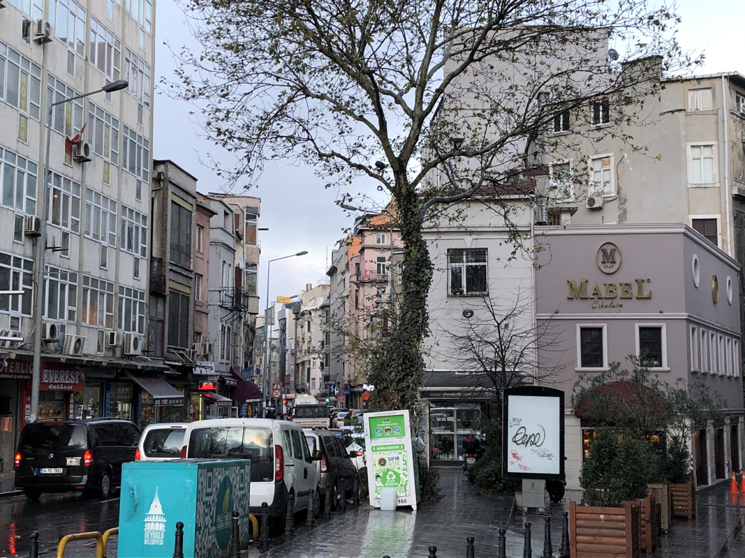
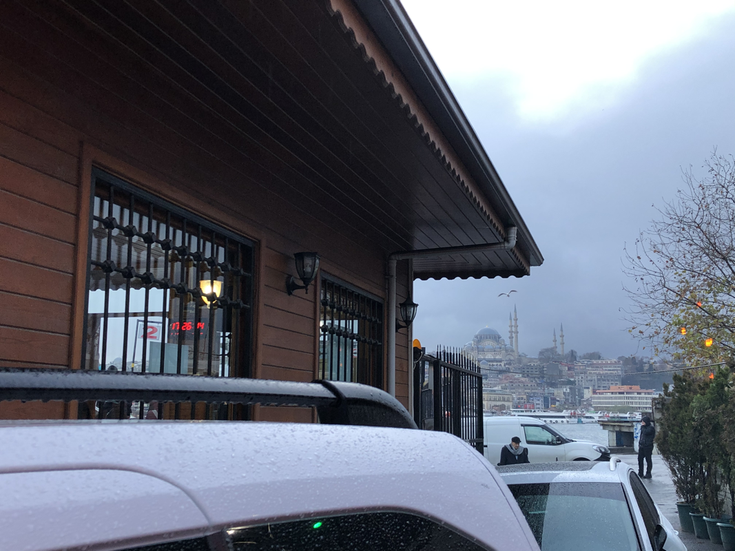
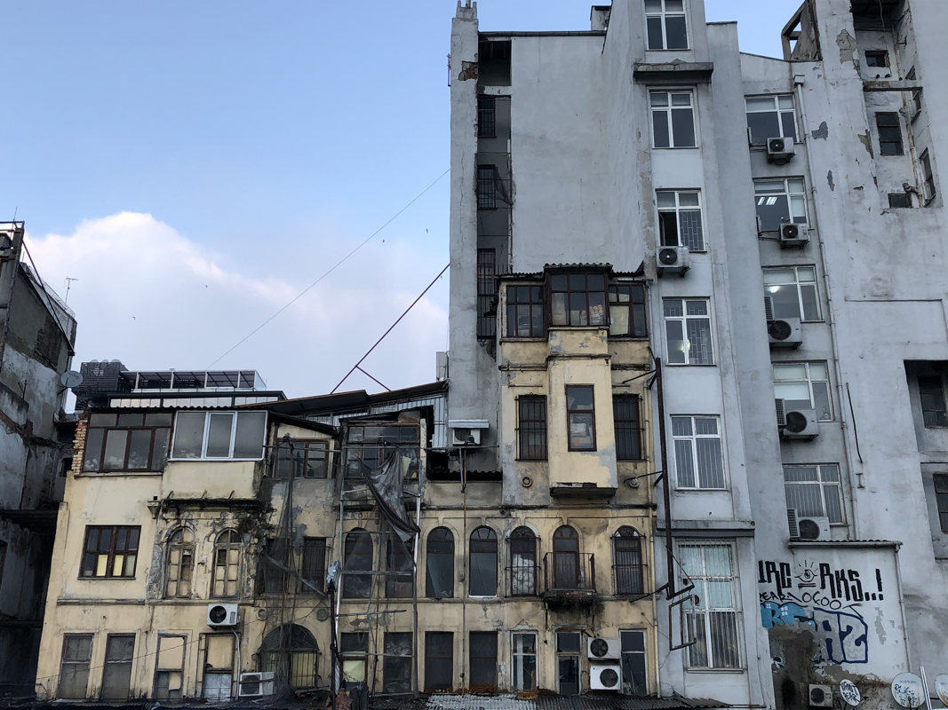
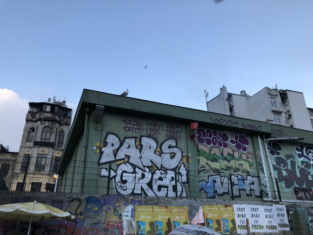
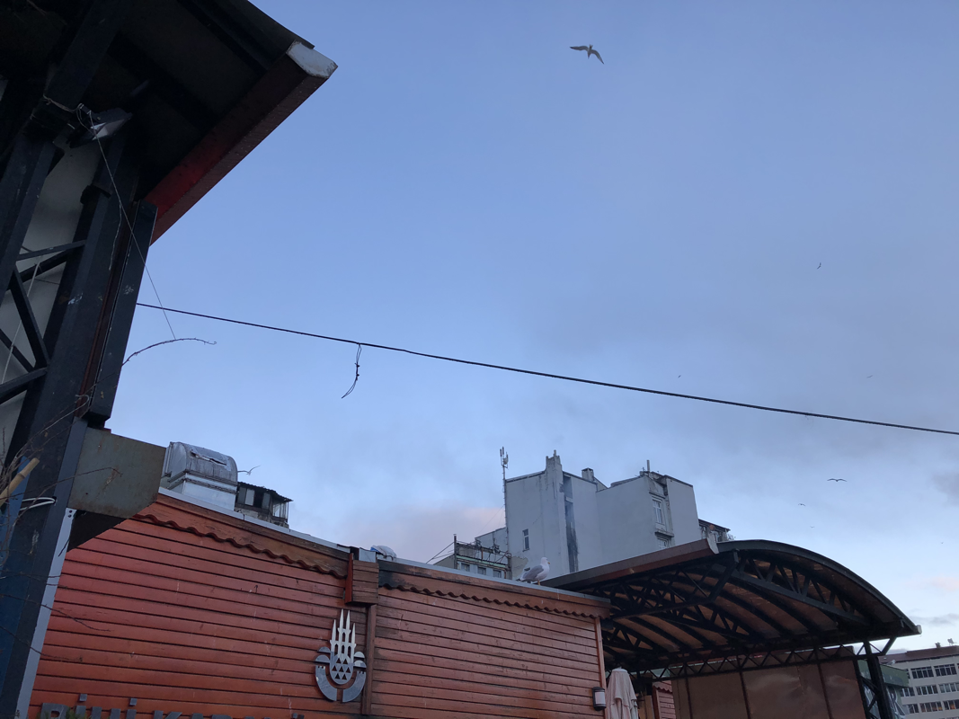
City: Istanbul
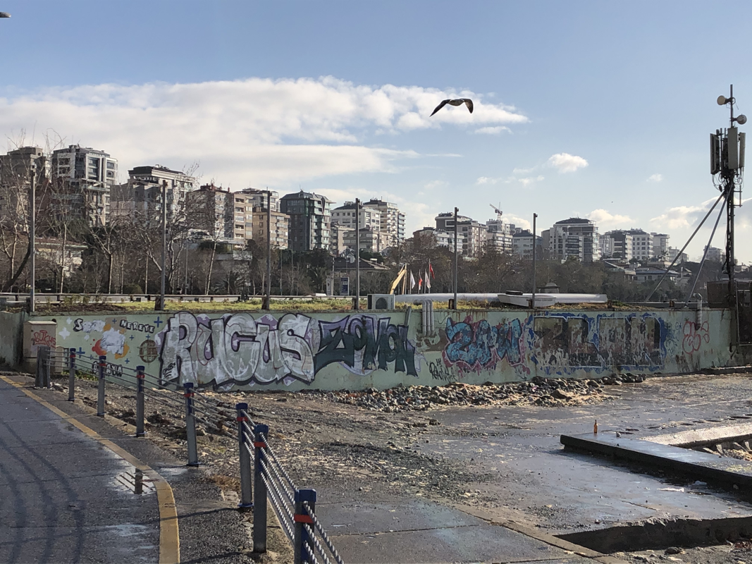
Collection of images I took of the general area and buildings in Istanbul:
(Hover above images for more details)
(Hover above images for more details)
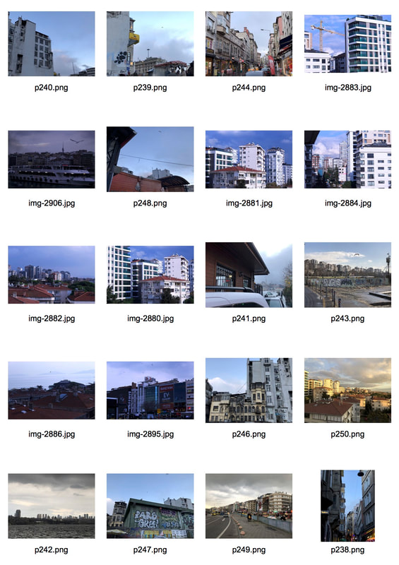
Contact Sheet
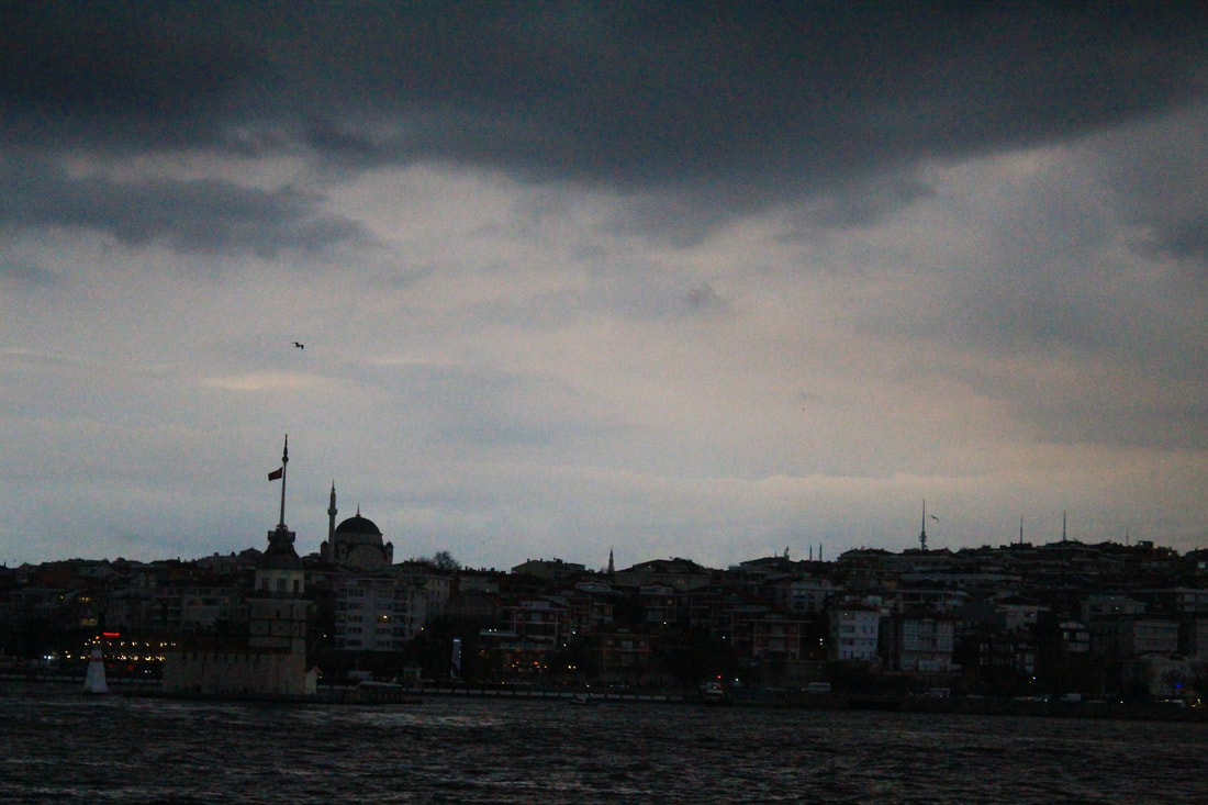
General Architecture & Landmarks

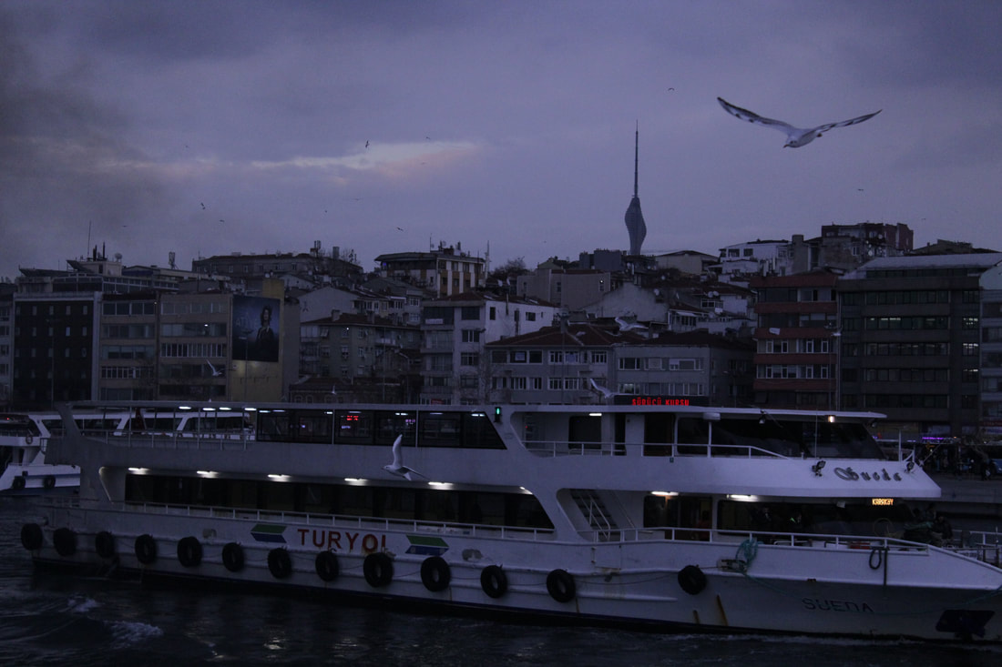
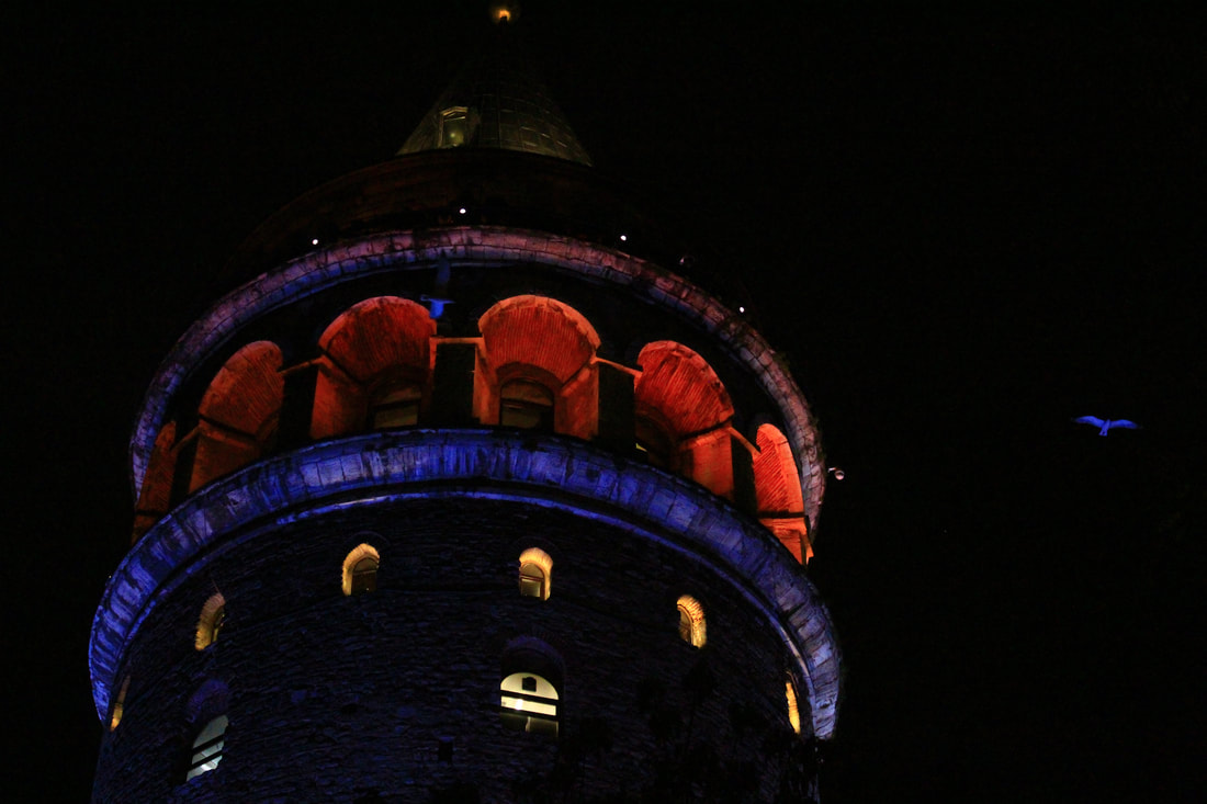
Galata tower in the district of Beyoğlu at night, pictured here.
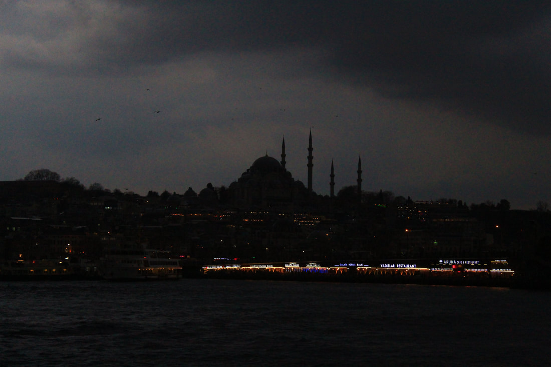
A silhouette of the Aya Sofia mosque.
|
|
I found that Istanbul offered a large variety of different types of buildings, and showed an incredible inequality between buildings. Some buildings are visibly run down and neglected, where as other buildings and structures are tall, modern and seemingly very expensive. This is one of the aspects of the city I sought to explore in my photographs, exposing its inequalities.
I believe, these inequalities are down to the fact that Istanbul is a place that is currently undergoing a lot of change and redevelopment, as seen by the many construction cites throughout the city, which I believe I captured in my images.
I believe, these inequalities are down to the fact that Istanbul is a place that is currently undergoing a lot of change and redevelopment, as seen by the many construction cites throughout the city, which I believe I captured in my images.
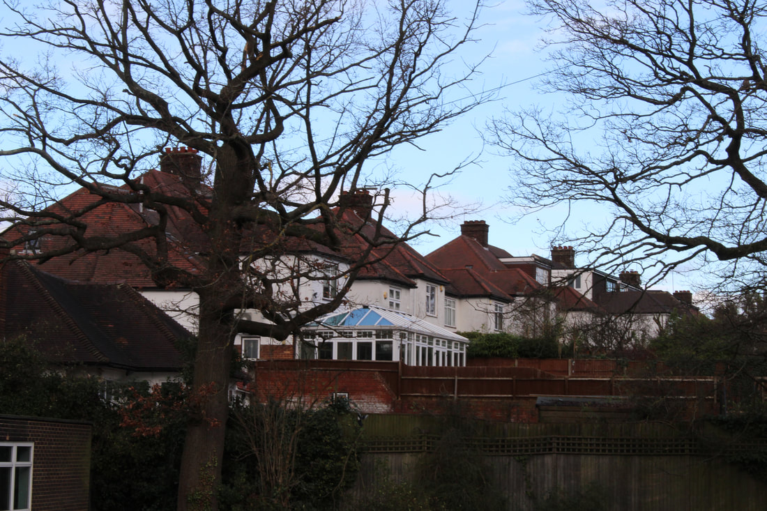
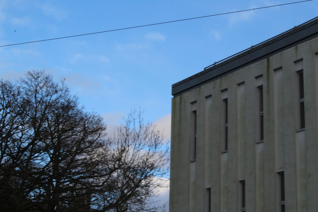
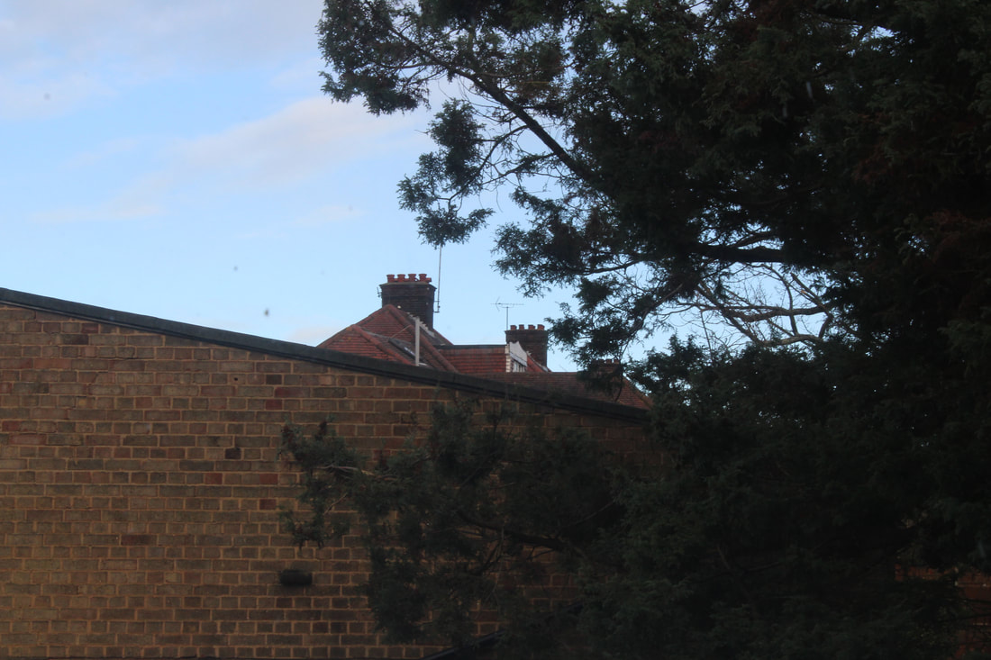
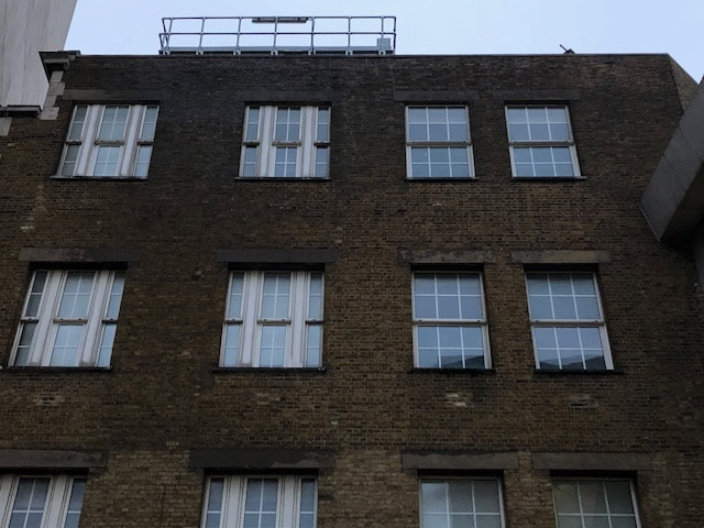
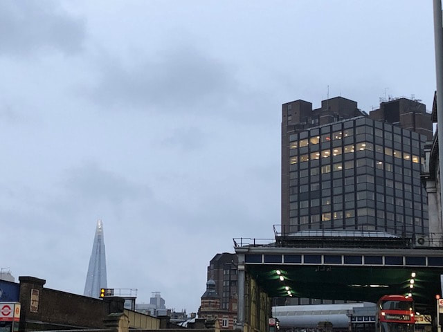
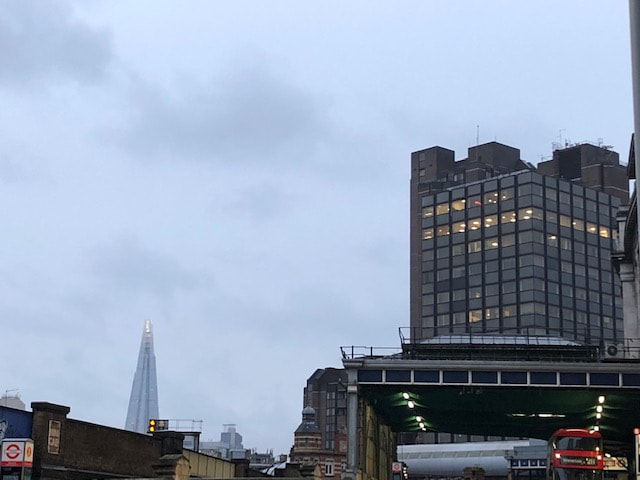
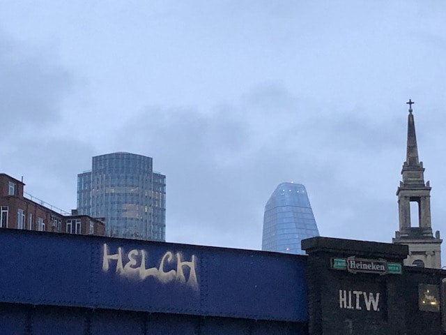
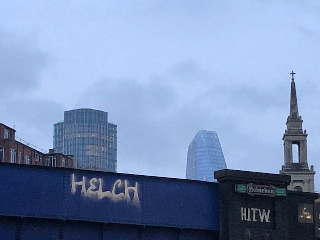
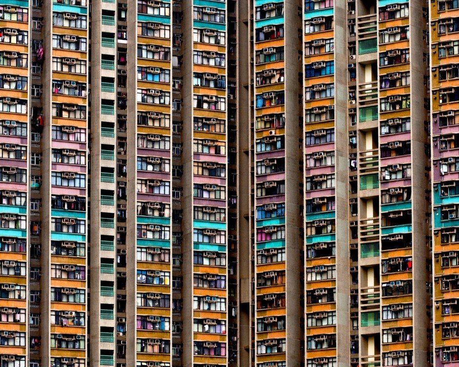
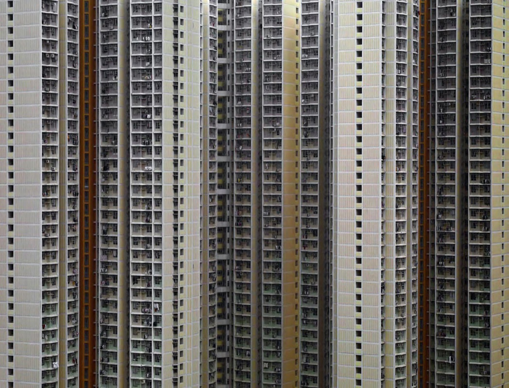
City: London
In this section I went to a wide variety of different areas in London (Central London and Residential areas alike) and photographed the area.

Link Artist- Micheal Wolf
|
|
|
EDITS
|
BEFORE
|
AFTER
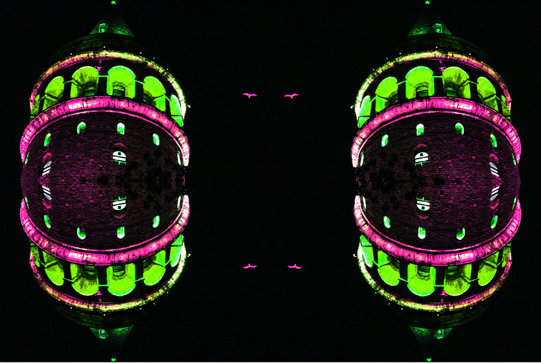
Here I have inverted and brightened the colours of the image of the Galata tower, then I mirrored the image 4 times.
|
Final Edit: Directly Contrasting Cities.
For this final piece I cut out some of the buildings from my shots in London and Istanbul, and I mashed them together to create one final 'city', made up of elements of both cities.
WWW: I quite like how smoothly the images have blended in together, the buildings came out more naturally than expected which I'm quite pleased with. In addition, the way that I blended some of the buildings in resembled the work of Micheal Wolf, which I think made this piece in particular quite interesting and unique.
